• Home
  • Reviews
    • Books
    • Comics
  • Features
    • Curation by Cee
    • Holy, Mother Cover!
    • Sincerely, Cee | A letter from yours truly
    • The Three C’s: Candid Conversations with Cee
    • You’re Just My Type | Fonts galore!
  • About
    • FAQ
    • Review Policy
    • Giveaway Policy
  • Contact

The Novel Hermit

daydreaming about books

Holy Mother Cover

HOLY, MOTHER COVER! | Changes in Dissonance by Erica O’Rourke

January 26, 2015 Comments : 10

holymothercover

Inspired by What She Reads, Pure Imagination Blog, and Stacked.

I admit I’m a book cover snob. Who isn’t though?

Book covers are the first thing that attracts readers to a book. A good cover can draw someone is, just as a bad cover can easily draw someone away. It can essentially make or break a book. Holy, Mother Cover! is where I showcase the book covers that stand out (or make me cringe), and discuss cover changes.

(A big special thanks to Georgie at What She Reads for bestowing me this fabulous name and to Charlotte at The Simple Tales for creating the beautiful feature banner you see before you.)

border

COVER CHANGE: Dissonance by Erica O’Rourke

[row][column size=”1/2″]What do I think about the cover design? Beautiful colors, but oh so grainy.

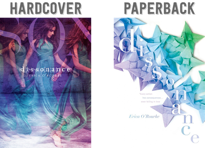
Three things I love about this cover: 1. the colors! The shades or blue and purple work really well here, and I think a large part of that has to do with the grainy quality of the photo. It gives it an extra something—an umpf; 2. the overlay effect. I really love how it looks, especially with the model in motion; and 3. the double dissonance. Do you see how there’s a faded, yet bigger “dissonance” over the title? I really like that!

However, the one thing that really bugs me is the weird “S O N” in big lettering on the top. Does it say “Dissonance” or something else? It’s just so weird that you can’t see it in its entirety.

Would I buy this book based on the cover? Sure.[/column] [column size=”1/2″]What do I think about the cover design? Meh, not very memorable.

It’s such a bland cover. Origami star-flower? I’m not sure what significance it is, but it just seems really odd. And it’s against a white background? Like what? I really don’t understand why the hardcover needed a redesign. The paperback hardly catches my attention; it’s a big fat yawn.

Though, I do like that the color scheme stays pretty much the same for this cover and the way that the colors of the title turns from white to the blue-purple shade.

Would I buy this book based on the cover? Hahaha, nope. [/column][/row]

Final Verdict: I guess the hardcover. 

Which cover design do you prefer? Would you buy the hardcover or paperback cover? 

Share this:

  • Twitter
  • Facebook
  • Tumblr
  • Pinterest
  • Email

Previous:
FROM PANEL TO PANEL | Why You Need To Read The Wicked + The Divine
Next:
YOU’RE JUST MY TYPE | Title Font Sleuthing

You might also enjoy

ARMCHAIR BEA 2014 | Special Holy, Mother Cover! Theme Post! WITCHES!ARMCHAIR BEA 2014 | Special Holy, Mother Cover! Theme Post! WITCHES!
HOLY, MOTHER COVER! • Changes in The Lovely Reckless by Kami GarciaHOLY, MOTHER COVER! • Changes in The Lovely Reckless by Kami Garcia
HOLY, MOTHER COVER! | Changes in Vanishing Girls by Lauren OliverHOLY, MOTHER COVER! | Changes in Vanishing Girls by Lauren Oliver

Comments

  1. Lola says

    January 26, 2015 at 1:57 pm

    While I like the colours on the covers, I actually like the paperback cover. It’s so simple and combined with the pretty colours and origami stars it makes me interested in the book. The hardcover isn’t bad either, but those 3 people and the SON letters are a bit weird. I would often prefer a cover without people over a cover with people, so maybe it’s that.

    Reply
  2. Nova @ Out of Time says

    January 26, 2015 at 3:51 pm

    This book was a DNF for me, but I’m definitely agreeing with you about the cover thing. I actually really don’t like the paperback. It just looks so weird and after having read some of the book, I fail to see how it fits, anyway. At least the hardback makes sense.

    I love this feature! It’s really awesome that you compare covers.

    Reply
  3. Kay @ It's a Book Life says

    January 26, 2015 at 4:41 pm

    I too like the colors on both the covers, but I’m not sure I would buy either one just based on the cover. Maybe the hardcover. Maybe. What a big change from hardcover to paperback!

    Reply
  4. Ashley @ Books by Migs says

    January 26, 2015 at 6:25 pm

    I like the idea of the paperback but it’s hard to read. The colors on both are completely beautiful though.

    Reply
  5. Megan says

    January 26, 2015 at 7:33 pm

    I think I actually prefer the paperback to the hardback. :P I mean, yeah, the hardback is gorgeous, and definitely eye-catching, but it also seems kind of generic in some ways. Beautiful model on the cover, check. Model in a pretty dress, check. Only they did a twist and included the duplicated model in different poses, haha. I think the paperback could be eye-catching because of the simplicity and the stark white-ness of the cover, but like you said, I don’t know if those origami stars have any significance to the story at all. (If they don’t, I’d buy the hb over the pb, no questions asked!)

    Reply
  6. Kayla @ The Thousand Lives says

    January 26, 2015 at 8:57 pm

    The paperback actually makes sense for the story, but it actually took me a while to figure out what those things were.

    And the SON actually spells out Dissonance when you hold open the entire dust jacket :)

    Reply
  7. Jillyn says

    January 26, 2015 at 10:43 pm

    I like both of them, but I think the original one is more catching.

    Reply
  8. Leigh @ Little Book Star says

    January 27, 2015 at 5:28 pm

    Woah I didn’t know this one already had a cover change! I actually prefer the first cover. The 2nd cover makes it look like it’s a contemporary book. It’s so misleading! If I didn’t know anything about this book and I just saw the 2nd cover, I’d think it’s about the MC who has an illness and the MC and another character will tackle the world etc.

    Reply
  9. Emma @ Emma Likes Books says

    January 30, 2015 at 8:48 pm

    I don’t think I would pick up either one of these based on the cover alone, but I do like the paperback cover a little better.

    Reply
  10. Ella says

    January 30, 2015 at 9:08 pm

    Am I allowed to say neither? Both are just kind of ‘meh’ to me and I can’t think off the top of my head but they both look similar to covers I’ve seen before.

    I love this post though. Such a cool idea. But it makes me wonder how my cover stands up to the critics!

    Reply

Leave a Reply Cancel reply

Your email address will not be published. Required fields are marked *

About Me


I’m Cee. Lover of books + comics. Bookseller. Former teen witch.

The Novel Hermit is written by a daydreamer who loves books and want to share her love with everybody. You will find YA, comics, reviews, discussions, book cover love, and lots of adoration for books. What more can you ask for?

Subscribe to Blog via Email

If you want to read more of my reviews and book cover discussions, or you want a narwhal to appear in your dreams, subscribe by email here!

Follow Me

Twitter Facebookg Goodreads Instagram Pinterest E-mail RSS

Recent Posts

  • REVIEW • The Vine Cutting Heist at Chateau l’etrange (The Suitcase Clone by Robin Sloan)
  • HOLY, MOTHER COVER! • HC vs PB: Kate in Waiting by Becky Albertalli
  • TOO MUCH TBR • August 2022
  • BOOKS IN HAND • What Books Customers Are Buying in July 2022
  • HOLY, MOTHER COVER! • HC vs PB: You Know Me Well by Nina LaCour & David Levithan

ARCHIVES

2022

  • – August (4)
    • REVIEW • The Vine Cutting Heist at Chateau l’etrange (The Suitcase Clone by Robin Sloan)
    • HOLY, MOTHER COVER! • HC vs PB: Kate in Waiting by Becky Albertalli
    • TOO MUCH TBR • August 2022
    • BOOKS IN HAND • What Books Customers Are Buying in July 2022
  • + July (5)
  • + June (9)
  • + May (8)
  • + April (4)
  • + March (3)
  • + February (2)
  • + January (5)

2021

  • + December (5)
  • + November (1)
  • + October (1)
  • + September (4)
  • + August (4)
  • + July (4)
  • + June (2)
  • + May (3)
  • + April (2)
  • + March (2)
  • + February (3)
  • + January (1)

2020

  • + December (4)
  • + November (1)
  • + October (6)
  • + September (2)
  • + August (3)
  • + May (1)
  • + April (2)
  • + March (4)
  • + February (2)
  • + January (3)

2019

  • + December (4)
  • + November (2)
  • + October (7)
  • + September (3)
  • + August (3)
  • + July (1)
  • + June (4)
  • + May (2)
  • + April (2)
  • + March (1)
  • + February (2)
  • + January (4)

2018

  • + December (3)
  • + November (3)
  • + October (2)
  • + September (3)
  • + August (2)
  • + July (3)
  • + June (2)
  • + May (6)
  • + April (11)
  • + March (9)
  • + February (7)
  • + January (7)

2017

  • + December (5)
  • + November (2)
  • + October (11)
  • + September (14)
  • + August (12)
  • + July (12)
  • + June (9)
  • + May (11)
  • + April (9)
  • + March (13)
  • + February (19)
  • + January (10)

2016

  • + December (9)
  • + November (11)
  • + October (12)
  • + September (15)
  • + August (8)
  • + July (16)
  • + June (15)
  • + May (16)
  • + April (17)
  • + March (18)
  • + February (19)
  • + January (15)

2015

  • + December (15)
  • + November (15)
  • + October (15)
  • + September (17)
  • + August (18)
  • + July (17)
  • + June (14)
  • + May (16)
  • + April (15)
  • + March (14)
  • + February (15)
  • + January (14)

2014

  • + December (14)
  • + November (14)
  • + October (13)
  • + September (11)
  • + August (14)
  • + July (14)
  • + June (14)
  • + May (17)
  • + April (9)
  • + March (18)
  • + February (19)
  • + January (21)

2013

  • + December (18)
  • + November (17)
  • + October (21)
  • + September (18)
  • + August (16)
  • + July (17)
  • + June (15)
  • + May (11)
  • + April (6)
  • + March (7)
  • + February (4)
  • + January (2)

2012

  • + December (2)

Disclaimer

All of the books I review either have been purchased by me, borrowed from the library, and sent to me by the publisher (the latter of which I will note).

All the words and opinions in this blog are my own. I am not paid to write reviews. Synopsis are taken from either the back of the book or from Goodreads.com.

Any use and/or duplication of my material without permission from me (the author and owner of The Novel Hermit blog) is strictly prohibited.

2022 The Novel Hermit. All Rights Reserved. Design by SkyandStars.co
Back Top

Copyright © 2022 · Yoon Theme on Genesis Framework · WordPress · Log in