
Inspired by Pure Imagination Blog and Stacked.
Let’s be honest, nobody follows the age-old cliché that tells us not to judge a book by its covers. If you say you do, I am side-eying you. Book covers are the first thing that attracts any of us readers to a book. Before you pick up a book, the cover can essentially make or break a book. If I don’t like a cover design, I won’t pick it up. Lucky for us, publishing companies publish different cover designs, especially when a paperback book comes out. Sometimes we like it, sometimes we don’t. Whatever the changes with cover designs, I will discuss it.
Today, we look at the cover of The Name of the Star by Maureen Johnson.
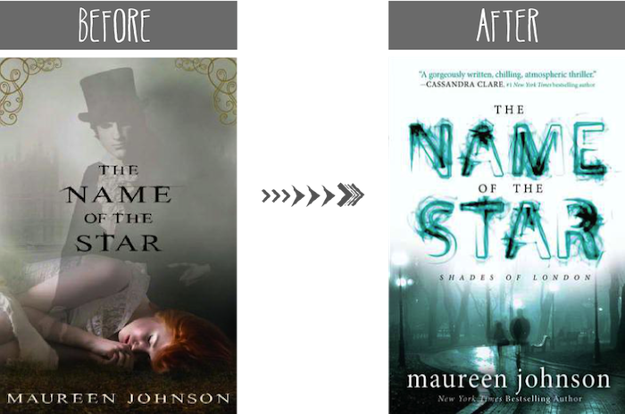
Ever since Lori (or somebody else I can’t remember at the moment) said that the guy on the front cover looked like Abraham Lincoln, that image refuses to leave my brain! Every time I pick up this book, I get confused, thinking, “why is Abe Lincoln on the cover?” and assumed that this book will be a historical YA novel about the President as a teenager who somehow ends up in the 21st century and falls in love with a girl here. (I am actually laughing just imaging it.) It makes no sense because this book is about Jack the Ripper. Where is the mutton chop on this guy’s face? (That was the fad in 19th century, right?) I think the two things I like about this cover is the gold borders on the top corners and the atmosphere of the image. It certainly indicates that this book has the 19th century influences (ie. Jack the Ripper and all that).
The paperback cover is slightly better than the hardcover. I don’t think about Abraham Lincoln, so that’s good. I love the title’s font and the smudges (or whatever you call it) in the letters. In the picture, I do get a feeling that somebody is being stalked. (Y’know, parks are a renowned place for stalking. ;) ) I think my only problem with it is the greenish-teal color. I like it, but it make me think of an infectious outbreak, not Jack the Ripper.
What did you think of the cover design and the changes? Will you now think of Abraham Lincoln when you look at the hardcover design? (I hope you do. ;D) Is there anything you would change?

I think it’s the top hat :D I like the “legend” of the Ripper, but “a historical YA novel about the President as a teenager who somehow ends up in the 21st century and falls in love with a girl here” would be fun to read too. And I agree, the paperback cover is better. And while it certainly doesn’t scream murder and blood, I do like the “greenish-teal” color of it.
It’s definitely the top hat! It throws me off. Who, other than Lincoln, wears that hat? ;D
Ha, it would definitely be a fabulous read.
Lol it actually looks like Abraham Lincoln! I like the paperback version too. It looks more mysterious, and fits the story.
A young Abraham Lincoln! ;D The paperback definitely does. I just can’t get the idea of the infectious disease because of the colors. :P
Hmmm…never thought about Abraham Lincoln before, but I definitely will now :) I love the colors of the new cover and I like how the people look like they are fading out!
YES. HE WILL HAUNT YOUR DREAMS! ;D The fading in and out definitely is creepy. It adds to the factor that somebody is stalking you. Ha.
I definitely prefer the redesigned cover. I remember when I first say the original cover I was totally put off by it and had zero interest in the book (yes I read books based off of covers. I can’t help it). That said, the paperback cover isn’t my favorite, but it does look much creepier and truer to the actually story.
YES. I remember thinking “that hardcover is creepy (in a non-scary way) because of the way the dude is placed over this sleeping girl.” (It’s okay. I do the same too. How can we not judge covers?)
I definitely wanted more from this cover. It didn’t give me any. :(
I’m not sure that I like both covers actually. I don’t know what is but both don’t seem like they fit the vibe of the story. Also, when I first saw the hardcover I thought it was an Alice in Wonderland type book. Then I read the description and was disappointed lol.
Basically, the book is about Jack the Ripper possibly coming back to present day and murdering people. I believe that the book is set in modern day, but the hardcover makes it seem like it’s going to be a historical YA book.
Yeah, the cover is certainly disappointing.
I’m a fan of the original cover at ALL. The colors are a little too dull and aren’t attention-grabbing, and OMG. Thanks for that picture, Cee. You’ve got your wish. Now all I can see is Abe Lincoln standing over a sleeping girl. Not a very nice image, as you can tell! But hmm… maybe the man is on the hardback cover for a reason. Maybe he bears a resemblance to Pres. Lincoln for a reason. Do you know where I’m getting at?! YES. ABRAHAM LINCOLN WAS SECRETLY JACK THE RIPPER.
Wait. Did they even live in the same time period? You know what? Just ignore my ramblings. What I’m trying to say is that I definitely prefer the paperback better, though it’s not as pretty as covers go. The colors are fine. I guess I just don’t like the background image, because it looks more like an adult murder-mystery than something in the YA genre. That’s just me being picky, though. :)
VERY PLEASED. I vow to make everybody see Abe Lincoln! That is my wish. ;D I agree, it’s really creepy that she’s on the floor and he’s just hovering. Like dude, let’s not with that creep factor. What will the girl think when she wakes up and boom, she sees a dude in a top hat over her? I would grab the nearest stick and bash it at him.
OH MY GOD. MAYBE IN THIS BOOK, LINCOLN NEVER DIED. HE FAKED HIS DEATH AND WENT TO BRITAIN AND SOMEHOW BECAME JACK THE RIPPER? ORRR JACK THE RIPPER IS AN INCARNATION OF ABE LINCOLN? Both would be fucked up. Lol.
I totally agree. I don’t like the background image, but I’m putting up with it. It just could be way better.
Hmm it does look like Lincoln-I think it’s the hat!
I actually bought this book last month but the cover’s different(here’s my cover https://www.goodreads.com/book/show/10805588-the-name-of-the-star).
I like the cover in the link, but I do like the teal one better because it matches the cover of the sequel(which is the cool shade of purple).
It is the hat! I can’t look at the hat and not think of Lincoln.
I looooveee the cover you bought. It just fits with the dark feel of the book and it’s frickin’ gorgeous!