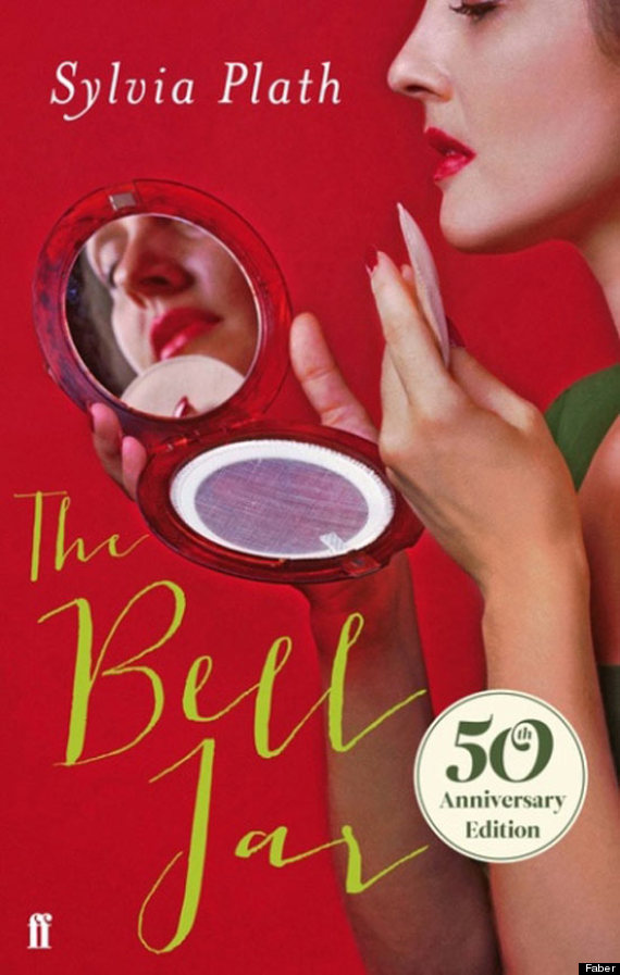
Let’s talk about this cover.
On the surface, what do we have?
- the title and the author – The Bell Jar by Sylvia Plath
- the vibrant red color certainly grabs my attention (but it is awfully misleading)
- a woman is applying makeup but her compact is empty
- it is a 50th anniversary edition
- and it’s absolutely horrible
For those who do not know the plot of The Bell Jar, it is about:
It chronicles the crack-up of Esther Greenwood: brilliant, beautiful, enormously talented, and successful, but slowly going under — maybe for the last time. Sylvia Plath masterfully draws the reader into Esther’s breakdown with such intensity that Esther’s insanity becomes completely real and even rational, as probable and accessible an experience as going to the movies. Such deep penetration into the dark and harrowing corners of the psyche is an extraordinary accomplishment and has made The Bell Jar a haunting American classic. (– Goodreads)
I have heard why people don’t like the cover and why people do like it. I personally do not like it. I understand why the publisher Faber needs a new cover that will catch the attention of young readers and gain a wider audience. The cover has to appeal to them, but come on. This cover presents this book like it’s “chick lit,” which it is not. (Why are novels by female authors always written off as “chick lit” when they have as much value as novels by male authors?) And this cover is not appealing. Strip away the vibrant red, and what do we get?
Okay, okay, I understand what the cover is saying if I analyze it. Here, we have a woman, who does not appear to be happy at all from the reflection of her compact mirror. She’s applying makeup, but we can see that there is no powder or anything in her compact; this suggests that the act of putting on makeup seems to be a monotonous routine the woman does. Putting on makeup also suggests that she has to maintain her appearance, especially how she is portrayed to her public both physically and mentally (which is a major theme in The Bell Jar). So, fine, this cover does relate to the book.
But let’s face it. Readers are not going to stand at a bookstore (or wherever they find this book) and analyze the cover. Even I rarely examine the covers very closely. A person who has no idea what The Bell Jar is about will most likely judge the book by its cover, glossing it over quickly (ignoring the subtle clues that the cover is suggesting to them), and may conclude that this book is lighthearted. Well, they are in for a surprise.
To me, the cover is visually awful. Unappealing. A mess. And it needs to go away now. (Why do I say this? Um, the vibrant red is all wrong for the book, the typography is absolutely horrible, and is her reflection in the mirror possible? It’s something an amateur photographer would shoot for a homework assignment that specified that they have to use bold colors and a mirror.)
If you give me the choice to decide which cover I want, I will take any of the covers below (even if they are as misleading as the one above because at least these are somewhat visually pleasing and exude those depressing themes within The Bell Jar).Read More
