Inspired by What She Reads, Pure Imagination Blog, and Stacked.
I admit I’m a book cover snob. Who isn’t though?
Book covers are the first thing that attracts readers to a book. A good cover can draw someone is, just as a bad cover can easily draw someone away. It can essentially make or break a book. Holy, Mother Cover! is where I showcase the book covers that stand out (or make me cringe), and discuss cover changes.
(A big special thanks to Georgie at What She Reads for bestowing me this fabulous name and to Charlotte at The Simple Tales for creating the beautiful feature banner you see before you.)
US versus UK: Wolf Wilder by Katherine Rundell
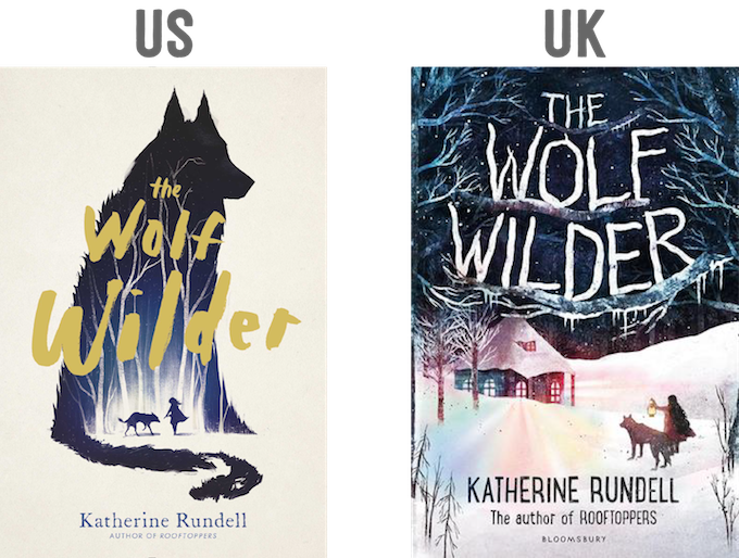
Let’s talk about the use of silhouettes here. It’s done so well in the US cover of The Wolf Wilder. I love that the night sky and a forest serve as a background inside the big wolf silhouette. I like that the gold is the only color that won’t blend with the colors that are used; it makes the title stand out more that way. This cover portrays all it needs to in an image that isn’t cluttery. You’ve got the girl, her wolves, and the setting. That’s it.
Would I buy this book based on the cover? Yes.[/column] [column size=”1/2″]What do I think about the cover design? Holy beautiful illustrations!
Okay, I admit I am blown away by the UK cover of The Wolf Wilder. I can’t stop staring. While the US cover keeps it simple, the UK cover has so much colors and details in the illustration. Look at the snow and the branches. The typography in this is absolutely gorgeous, and I love the way the title sits on the tree branches so naturally. There’s so much color in this, and it blends together beautifully. Love.
Would I buy this book based on the cover? YES, YES, YES. [/column][/row]
Final Verdict: Yes to both covers because they have gorgeous illustrations on it! But if you really force me, the UK one.