Inspired by What She Reads, Pure Imagination Blog, and Stacked.
I admit I’m a book cover snob. Who isn’t though?
Book covers are the first thing that attracts readers to a book. A good cover can draw someone is, just as a bad cover can easily draw someone away. It can essentially make or break a book. Holy, Mother Cover! is where I showcase the book covers that stand out (or make me cringe), and discuss cover changes.
(A big special thanks to Georgie at What She Reads for bestowing me this fabulous name and to Charlotte at The Simple Tales for creating the beautiful feature banner you see before you.)
COVER CHANGE: The Unfinished Life of Addison Stone by Adele Griffin
From the reviews I’ve read about this book, The Unfinished Life of Addison Stone tells the story of Addison Stone, an artist who had died via mysterious circumstances, through different mediums like interviews, art, newspaper clippings, and etc. It’s sort of like an investigation or unofficial biography about what happened to Addison Stone.
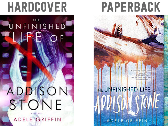
It’s only fitting that the covers of the hardcover and paperback take on a different kind of art form. For the hardcover, the cover uses something you usually find in photography: a color negative. This cover is like trying to capture Addison Stone in a picture. I love the the effect of the inverted colors. You can’t see the girl’s face clearly, which makes the cover mysterious and fitting to the mystery of Addison Stone. It makes the image look creepy, especially with that red ‘x’ across the girl’s face. We’re all trying to figure out who Addison Stone is.
For the paperback, the cover uses the art of painting. It’s a vastly different medium from the photography of the hardcover, and I love how different it is. I love how the paint pools around and drips down, and how her hair covers her mouth, almost conveying she can’t speak herself. To me, this cover paints what they imagine Addison Stone to be like, and it sort of parallels how the actual story is trying to paint who Addison is and what happened to her through people’s interviews, magazine clippings, and so on. It’s food for thought.
Final Verdict: What cover do I like better? I like both covers equally. They have different mediums of art I enjoy seeing on covers.


Hi Cee.
I prefer the hardcover over the paperback, though I do not like the ‘X’ over her face. I suppose that warns the reader that this will be a dark read.
I like the visible eye of the paperback. It makes a connection with the viewer. I wish the hardcover had an element like that. The other aspects of the paperback; the colors and the blood-like running colors/dead face in silhouette, are not as appealing, I guess they give an accurate portrayal of what is coming in the book, such as a grim murder investigation. I like it when a book is honest and the cover art gives an accurate description of what is within.
~Icky. :-)
I really love the second cover, although with the way that you described the book I think the first one makes more sense. They’re both beautiful in their own individual way and it’s incredible how two extremely different covers can both emit the same emotional response from me: creeped the f out.