
Inspired by What She Reads, Pure Imagination Blog, and Stacked.I admit I’m a book cover snob. Who isn’t though?
Book covers are the first thing that attracts readers to a book. A good cover can draw someone is, just as a bad cover can easily draw someone away. It can essentially make or break a book. Holy, Mother Cover! is where I showcase the book covers that stand out (or make me cringe) and discuss cover changes.
(A big special thanks to Georgie at What She Reads for bestowing me this fabulous name and to Charlotte at Gypsy Reviews for creating the beautiful feature banner you see before you.)
Summer will officially start on June 21st, and what better way to celebrate the start of summer by taking a look at Sarah Dessen’s summery book covers?
For the next eleven weeks, I will be showcasing the cover of Sarah Dessen’s books. Yes, you heard that right. Eleven. Weeks. Eleven glorious Sarah Dessen book covers. Her books are the embodiment of summer. It will be awesome.
Shall we start?
THEME: The Truth About Forever by Sarah Dessen
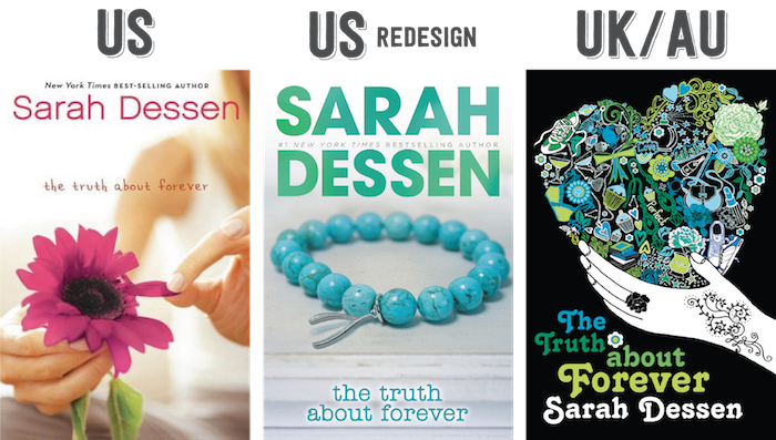
It’s not a great cover, but it’s what most readers are used to seeing on the cover of The Truth About Forever. I’m sure that many people look at this cover nostalgically. When I look at it, I feel like this cover can do more. The girl plucking out the flower petals makes me think of the “He loves me, he loves me not” game. Not sure if that’s what the cover is aiming for. I just don’t feel like it properly portrays what we’ll find in the plot. [/column] [column size=”1/3″] Mehhhh.
I love the coloring of the redesign cover. It just works because the shades aren’t that much different from each other. The font for “Sarah Dessen” is great, whereas the font for the title has a lot to be desired. I’m not a fan. It’s forgettable and doesn’t work with the above font. Plus, why is it so small? It doesn’t stand out. When I look at it, my eyes aren’t drawn to the title (which it should be). Also, a beaded bracelet? Really? Not very summer-y. But hey, wishbone! :D[/column] [column size=”1/3″] The UK/AU cover is very trippy and ~groovy. (Yes, I said it and yes, I am cringing.)
The lettering is very 1960s, which is kind of weird since the book doesn’t take place during that time period. I think it’s quite distracting and gives me a headache. Despite the title font, I love the illustrations inside the heart and how it’s woven together. I think it captures the things you’ll find in Macy’s life. And if you look closely, you can spot the wishbone. ;D Do you see it? [/column][/row]
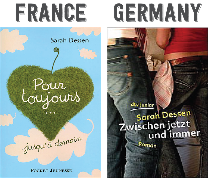
[row] [column size=”1/2″] The French cover is, how do you say, mignon. (That’s cute in French!)
I really like it. It’s simple. The cursive title looks good. The grass looks like an apple shaped as a heart. (I’m not quite sure what’s that suppose to symbolize.) The leaves remind me of autumn because of its shape, which is bad because this is a summer book, right? I do like how the leaves look like they’re slowly floating down in the sky. It’s an overall passable cover. [/column][column size=”1/2″] Borinnnnggggg.
Why is this an option? Even the original cover is better than this one. Do I want to see the models’s backside? Nope. What are they doing? I have no idea. Is it just the quality of the picture or is the dude kind of out of focus? I don’t know. Maybe. It’s really bugging me. The German cover is extremely forgettable. You’re better off sticking with the original US cover. [/column][/row]
MY PICK: US redesign. (It’s the least offending to my eyes.)

Ah, they all have a cute quality but I think I prefer the UK/AU cover, just scratch the font and inverse the colours. It makes for a really interesting cover.
I think after that the French and Swedish cover would be my next choices.
I love those covers and the books of course. Great summer idea!
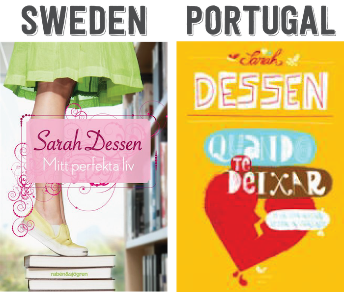
Lol I don’t like the Sweden edition also just because the girl is stepping on books! Like, who does that!? Haha. I really like the UK/AU and France editions. They’re really unique and just eye catching.
I don’t really love any of them, but I think the US one is the best. The France one is cute too.
Wow those are all so diverse! I like France and Sweden the best!
Missie @ A Flurry of Ponderings
(Just as you love the blockquotes, I will not stop talking about the comments. IT LOOKS SO GOOD *TEARS UP*)
Meh, the US cover looks kind of boring. I mean the colours look nice but that font is just too plain and boring. The use of sans-serif for Sarah Dessen doesn’t work and it’s really forgettable. Now the US redesign is better to me, still a very plain cover but the cover on the author name? BOOM! Explosion of colour and it’s beautiful.
Lol the UK/AU cover does look very hippish and ~groovayyyy~ though this is the one I remembering seeing around. It’s really old YA if that makes sense? I do like the detail in the heart because that’s cute but still, not a huge fan of it.
Mmm France, cute use of fonts but it tells me so little about the story. IDEK about Germany, looking at the backsides of people isn’t attractive at all. I don’t know what they were thinking with this.
Okay Sweden’s would have been cute if she wasn’t standing on books and the title treatment just THAT BRUSH CEE. IT’S SO 2000 WITH THE GRAPHICS MAKING. CRYING. AND THE FONT THEY USED FOR SARAH DESSEN. I CANNOT.
I appreciate the Portugal’s cover use of medium and creativity but idk, the scrapbookish effect seems so messy. It needs more tidying up.
The redesigns of Dessen’s covers annoyed me so much! I mean, I’m in the UK anyway, so they didn’t affect me that much, but PRINCIPLE. They’re all so generic and boring and I just think if you’re going to redesign a cover, can’t you make it BETTER?
The redesigns are my favourite of the Dessen covers, actually. I mean, they’re not great, but they’re perfectly serviceable and a lot better on the eyes than the dated original covers and the downright ugly UK covers! I’d take bland over groovy and trippy any day!
I always feel bad for the authors that get stuck with bad covers…Anyway, I like the first US cover the most. The redesign is okay too. I like the Swedish one, I just don’t think it works for this book with that font.
I love the Redesigned SD covers!! Although this one is not my favorite… I still like it. The original US one is OKAY. That Germany one is BLAH!!! And I hate the UK covers. Just Listen is the same way with the 60’s vibe going on. It just does not make sense!!! Can’t wait to see the rest of her books on here :)