I love fonts. You can say I’m obsessed with collecting them all. It’s no secret to those who know me. You’re Just My Type is a new feature where I showcase the fonts I absolutely adore and use. And hopefully, you will love the fonts I pick. Add all of them to your font collection! Let it grow!
It feels like it’s been forever since I properly picked out fonts. It’s not quite like riding a bicycle, but hey, I still feel the same joy of finding new fonts!
Also, I have a fabulous new banner! (A joint effort by Charlotte and I, for once!) Isn’t it adorable? I wanted the banner to be like an airplane flying with a love note in the banner for all to see. A boat works better for my blog because y’know, it’s very ocean-themed. ;D ![]()

Designed by Joshua Brooks
Fun fact: When I was younger, I thought that if you swallowed the watermelon seeds, it’ll grow in your stomach, so I rarely ate them because I feared one will grow in my stomach.
Watermelon is a great cursive-esque font. It has a good weight though. I like that it isn’t so swoopy. It doesn’t really remind me of watermelons, but it looks summery. (It’s the name.) As Charlotte said, “I could see it on a poster selling lemonade.” I agree with that! Slap this font on a sign, and you’re golden.
Designed by Tension Type
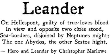
Leander sounds like a character from a Greek Epic where lots of people die because of territory issues. It’s also the name of this gorgeous font. I like that the lettering isn’t smooth. It has some roughness around it that gives it personality. If you need a font for something kind of ancient-esque, maybe this font will be a good choice. (It’s not lettering you’ll find in ancient Rome or wherever, but it’ll do.)![]()

Designed by Brittney Murphy Designs
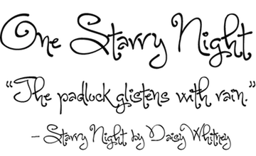
One Starry Night, I wish I could see you in the skies. (Unfortunately, I don’t see the stars because of light pollution. It sucks.)
This font is very whimsical to me. I think it’s because of the name. It makes me think of Van Gogh’s Starry Night. This font has great curls to it without looking too overwhelming (unlike the dreaded Curlz). It just looks like fun. And don’t we all want fun in our lives? ![]()

Designed by Tyler Finck
I’m giving you a night call to tell you how I feel
I want to drive you through the night, down the hills
I’m gonna tell you something you don’t want to hear
I’m gonna show you where it’s dark, but have no fear
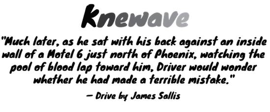
Knewave reminds me of Drive and the song “Nightcall.” I don’t know why, but I think it’s because of the name and how ’80s it is. (But that’s just me.) The strokes on the lettering is very marker-esque. Instead of grabbing a Sharpie, you can grab this font. ![]()


LOOK AT THE BANNERRRRRR EEEEEEEK!!!! And the boat idea is so much better, I mean how were we gonna get a crab on a plane? Lol (I just thought how though but shhhh).
HAHAHAHA YOU DID QUOTE ME, OH CEE <3 and lol but why were you swallowing the watermelon seeds in the first place?
Leander really does look Roman-esque and gives off that historical fiction vibe but I could oddly see it being used for horror or mystery too because of how gritty it is.
Oh boy, I don't even want to think of Curlz *shudders* On first impression I don't like One Starry Night but the more I look at it, the more I do. Unlike many cursive/calligraphy fonts it doesn't feel as stilted. But I just realised how fitting it would be for those temporary tattoos you would paste on as a kid lol (I've ruined it haven't I? :P)
Huh, I know I told you I think of surfing when I saw Knewave but now, not really. Hard to put my finger on how I feel about it but it is the perfect bold marker-ish kind of font.
LOL now all I can think of is, “I’ve had it with these motherf*cking crabs on this motherf*cking plane!”
I love these. Don’t change them. Thanks bye.
The banner, Cee! THE BANNER!!! It’s beautiful! *strokes lovingly*
I love the new banner! It is adorable. :) My favorite font this time would have to be Watermelon. It would work great for a lemonade stand.
Knewave looks epic especially since the color of the font goes from dark to light. I think I have Watermelon. One night I was downloading a bunch of fonts and I think I downloaded that one b/c it’s just so eye catching!
That banner is SO ADORABLE! I want to pluck that little crab right off the boat and give it a hug it’s so cute! Nice fonts. I especially like Watermelon!
I love the format of these posts! I think they’re great the way they are! :)
And Watermelon is fabulous. If I do sell lemonade this summer, I will most definitely be using it for my sign! :D
I LOVE VAN GOGH’S STARRY NIGHT, OKAY. AND THE NEW BANNER IS AWESOME. I MIGHT LIKE IT MORE THAN I LIKE YOU.
I like the Watermelon font but I don’t like Watermelon and if we’re sharing our awkward truths then you should know that I never could answer if the chicken came first or the egg.
Leander is good. I like it.
One Starry Night is whimsical but it’s not a me-whimsical which means I can never make it work. =P
I think I’ll understand Knewave better if I listen to that song you mentioned. Ha ha.
Your blog just keeps getting prettier and prettier, Cee! *sobs* And Charlotte has done it again — that banner’s gorgeous! And so are all these fonts, omggg. I like all of them, but I think Kneewave is my favorite because it looks so different… or did you add the color gradient yourself? :P Anyway, it kind of looks like fading paint, which I love.
I don’t know where you find all these awesome fonts, because I sure as hell can’t find that many pretty ones on dafont. <3 And noooo, keep your formats the same, please! Unless, y'know, you come up with a better idea, then go ahead. xD
Huh, that Leander font might work for the edit I’m doing right now for the guys in The Grisha trilogy. And that header is just absolutely cute, I don’t know where Charlotte gets all those graphics because I seriously want to know. And what is that font that you used for the header?
Anyway, I’m just going to scroll back through all your posts and search for some regal and thin serif fonts. Hopefully with some fancy elements around them.
That darn header CEE I CANNOT WITH THE CUTENESSSSSS ARGGGGG.
I totally thought that things would grow in my stomach if I ate seeds, too, haha XD
My favourite fonts today are Watermelon and Leander. I love Watermelon because it’s all cursive but not over the top (and there is a FINE LINE when it comes to cursive fonts). Leander is just gorgeous because I like the typewriter-esque flicks on the letters. Definitely agree with you on the tragedy thing. “Fin.” would look awesome in that font.
As for your question, I like the formatting of these posts! It’s easy to see which font is which, and I like your talky bits. ^.^
I love Leander! I like how it’s rough, like you said. I’m ultimately a sucker for anything that just slightly looks like chalk writing, which this does to me for some reason.
The banner is so cute! It’s a chubby boat. :) I like Leander and watermelon of the four. Leander actually makes me think of Edgar Allan Poe or Lemony Snicket. Basically, macabre or gothic books!
I love love love Watermelon! It’s so cute and curly!