
Inspired by What She Reads, Pure Imagination Blog, and Stacked.
I admit I’m a book cover snob. Who isn’t though?
Book covers are the first thing that attracts readers to a book. A good cover can draw someone is, just as a bad cover can easily draw someone away. It can essentially make or break a book. Holy, Mother Cover! is where I showcase the book covers that stand out (or make me cringe), and discuss cover changes.
(A big special thanks to Georgie at What She Reads for bestowing me this fabulous name and to Charlotte at The Simple Tales for creating the beautiful feature banner you see before you.)
Cover Change: The Lovely Reckless by Kami Garcia
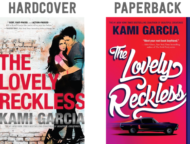
When I first saw the hardcover design of The Lovely Reckless, I wasn’t a fan. I couldn’t see myself picking up this book because of the cover. The typography left a lot to be desired. I didn’t like the glare of the gray in Kami Garcia’s name. I thought the watercolored graffiti-like couple could’ve been done a bit better. It’s just super forgettable.
Now that paperback cover, I like. The font is fabulous. I found it extremely fitting with the muscle car because it gave a sort of retro vibe. I like the blurs behind the car, making it look like the car is on the go. The red is very eye-catching. It’s a simple, yet striking cover.
Final Verdict: What cover do I like better? Paperback!


 One of the great team names in Marvel history returns, in incredible new fashion! During the fallout of Civil War II, Ms. Marvel, Nova and Spider-Man quit the Avengers and strike out on their own! With Viv Vision and the Totally Awesome Hulk by their side, these young heroes are determined to change the world their own way – and they’re only the beginning! It starts as an idea. It becomes an ideal. But what happens when it turns into a movement – one so big even the Hulk can’t stop it? And will one of the greatest X-Men of all forge a new future by their side? Welcome to the Champions, Cyclops! Unfortunately, not all of your new would-be teammates are glad to see you!