Inspired by What She Reads, Pure Imagination Blog, and Stacked.
I admit I’m a book cover snob. Who isn’t though?
Book covers are the first thing that attracts readers to a book. A good cover can draw someone is, just as a bad cover can easily draw someone away. It can essentially make or break a book. Holy, Mother Cover! is where I showcase the book covers that stand out (or make me cringe), and discuss cover changes.
(A big special thanks to Georgie at What She Reads for bestowing me this fabulous name and to Charlotte at The Simple Tales for creating the beautiful feature banner you see before you.)
US versus UK: A Thousand Nights by E.K. Johnston
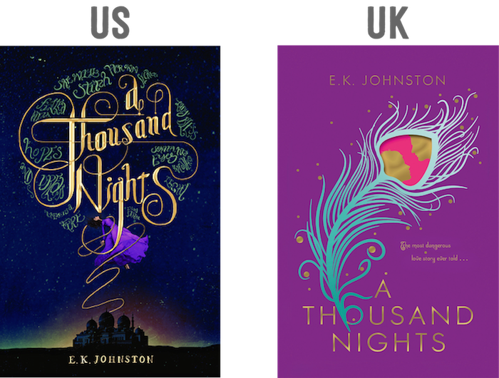
How gorgeous is this cover of A Thousand Nights? I love the girl being swept up into the night sky by the beautiful typography of the title. It makes me think that she’s being beamed up. Speaking of the beautiful typography, just take a look at it. Heart eyes. I love it so much. It’s so epic, and I love that it glints, as if light is being shined on it. You see the green squiggles surrounding the title typography? Those are more lettering; I hadn’t realized that until I saw a close-up.
I don’t have anything bad to say about this cover.
From this cover, I know what to expect of this book.
Would I buy this book based on the cover? YES.[/column] [column size=”1/2″]What do I think about the cover design? So pretty.
I’m very in love with the colors used in this UK cover. The purple, sea-green, the pink, and the gold work so well with each other. The sea-green feather looping around the ‘o’ in the title is a wonderful detail. I love the silhouette inside the pink of the feather because it makes it more than a feather; it shows that this book has romance in it. If the cover uses foiling for the gold, it would look really awesome.
Although the colors are great, I’m a bit confused at what the feather is supposed to represent. I don’t get how it relates to the plot. Maybe once I read the book I will understand?
Would I buy this book based on the cover? Eh. [/column][/row]
Final Verdict: Definitely the US! There’s so much detail to it that makes the cover so gorgeous.

Yes, the US cover for this is just gorgeous. The lettering is actually related to the story, and while I didn’t enjoy the book that much, I just want to bow to whoever made this gorgeous cover.
As for the UK, I got heart eyes when I saw it too, but now that you mention it, I don’t see the importance of the feather either. And that’s after reading the story already.
Oh my goodness—I think it’s pretty rare that both the US and UK versions of a cover are so pretty. But overall I prefer the US one! You’re definitely right in saying that the UK cover doesn’t tell us much about the story, though, and the typography on the US one is just *too much*. I adore it.
Great post, Cee! (I’ve kind of been a lurking blog reader for a while and I should have come here to comment sooner! I love this feature, by the way. I get to ogle gorgeous covers AND read your commentary, which is always spot-on.)
I agree – definitely the US cover. I love the UK colours, but I don’t understand what it represents really.
I just requested a review copy of this today, so funny that I came upon your post for it. :)
Oh wow, I think this is the first time I prefer the US cover than the UK! I think the UK edition is way too simple compared to the US. I also love love love the color scheme in the US edition. It looks so mysterious and it fits the story’s premise.
The UK cover reminds me a little too much of The Girl at Midnight and the Ava Lavender (?) book with the feather! I think I too prefer the US. It seems more suited to the story.
The feather is pretty in the UK version but that magenta is just so painful on my eyes! The US version is more subtle and nuanced; it’s gorgeous <3
This is the first time I saw the UK cover but I still prefer the US one. The colors are gorgeous, the typography is awesome, and the details! Especially that girl.
I agree. The US cover is quite mesmerizing, and the fact that those green squiggles aren’t squiggles at all makes the cover even better.
I definitely prefer the US one!
Krystianna @ Downright Dystopian
I prefer the US cover as well, but I agree with you that the UK cover is pretty.
I like the US cover too but I would get the UK hardcover (collector’s ed i think?) just because of the decals on the side and the cover of the book after you remove the dustjacket… it is so pretty :)