
Inspired by What She Reads, Pure Imagination Blog, and Stacked.I admit I’m a book cover snob. Who isn’t though?
Book covers are the first thing that attracts readers to a book. A good cover can draw someone is, just as a bad cover can easily draw someone away. It can essentially make or break a book. Holy, Mother Cover! is where I showcase the book covers that stand out (or make me cringe) and discuss cover changes.
(A big special thanks to Georgie at What She Reads for bestowing me this fabulous name and to Charlotte at Gypsy Reviews for creating the beautiful feature banner you see before you.)
This past Tuesday was the book birthday of Jandy Nelson’s latest book, I’ll Give You the Sun (everyone should read this), and I wanted to celebrate it (even though it’s a bit late). I thought why not do a cover change/theme post of her first published novel, The Sky Is Everywhere?
And booom, here we are.
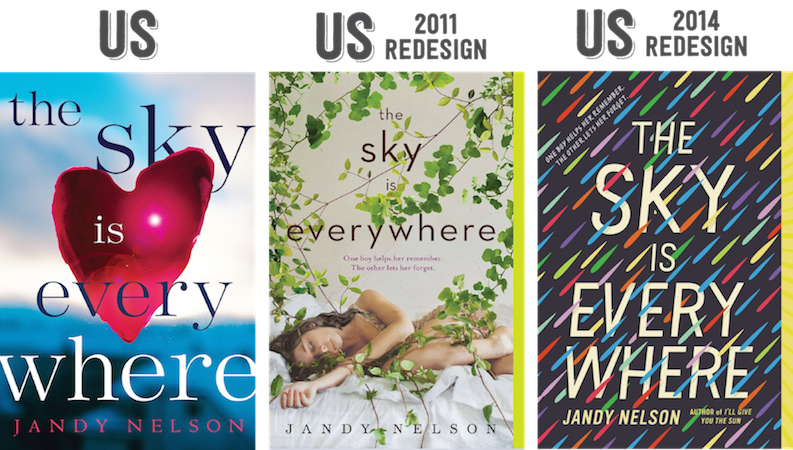
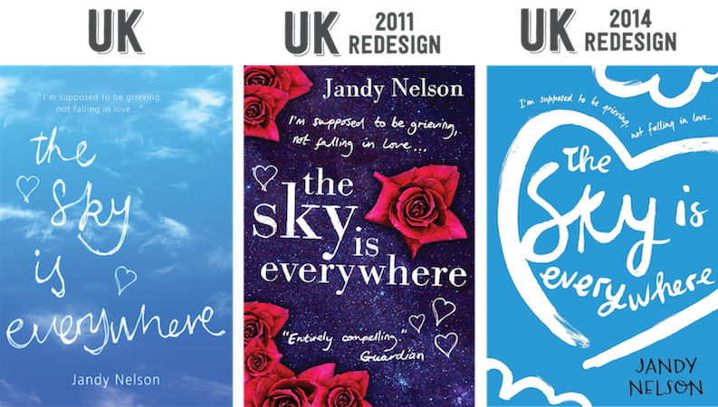
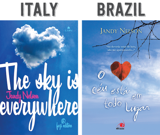
Not surprise that most of these covers use the sky theme. (It’s right there in the title!) Let’s see what else you can notice about these covers.
THEME: The Sky Is Everywhere by
Jandy Nelson
![]() Now for my favorite part!
Now for my favorite part!
 [/lightbox]
Such a hard pick. I couldn’t decide. Both paperback covers are incredibly gorgeous. In the end, well. You see what I picked. I just love the colors that are used. [/column] [column size=”1/3″]FOREIGN FAVORITE
[lightbox type=”image” src=”http://i1274.photobucket.com/albums/y425/thenovelhermit/JandyNelson-TheSkyIsEverywhereDenmark_zps8367b9c9.jpeg”][/lightbox]
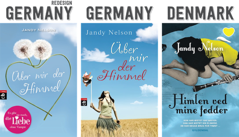
I love that this cover emphasizes on the music, which is an important thing in the book. And I like the grainy image of the girl’s skin. It’s a nice effect. It makes me think she’s fading away or in the past still.[/column] [column size=”1/3″]LEAST FAVORITE
[lightbox type=”image” src=”http://i1274.photobucket.com/albums/y425/thenovelhermit/leastfave_zps9301c049.png”][/lightbox]
Oh god, these covers. Horrible covers. 1. The font choice is alllll wrong and 2. it uses the space in the cover awkwardly. The placement of everything either uses too much space or doesn’t use it at all, which is a major problem. [/column][/row]

The sky and the hearts is something that seems to be featured on quite some covers. They also all seem colourfull, although this might just be a coincidence.
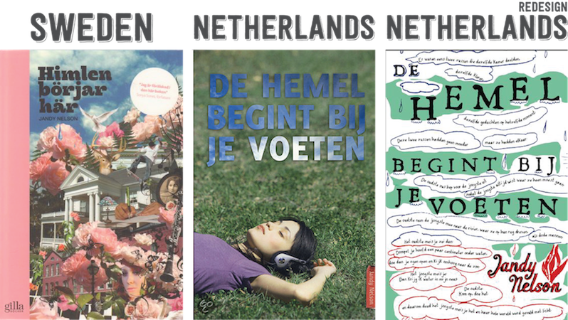
I also had to smile about the dutch title, I always think it’s funny to see how they translate titles as they always seem to mean something different then the english title or have a different nuance. In this case the dutch title says literally translated “the sky/ heaven starts at your feet”.
I think my favourite of these is the UK one or the UK 2011 redesign.
I want to own us redesign with the girl sleeping in leaves. It’s my favorite.
I do not like Swedish cover. Too much stuff. Overcrowded and looks old.
US 2011 redesign is my fave. I mean it incorporates the story and if I hadn’t read it, I’d DEF want to pick it up!
My favorite is the US 2014 redesign. All the bright colors and the interesting pattern really makes it stand out.
I love how colorful the US 2014 redesign is! But, I also really love the simplicity and the airiness of the original UK version. I mean…the sky is literally everywhere on that cover.
My favorite is actually the UK original version – I’d be more likely to pick that up than the new US paperback! I do like the German redesign as well, but the UK is definitely my favorite.
I haven’t read this book but I like the 2014 redesign for the UK and US. I’m not a big fan of the Swedish cover.
NOOOOOOOOOOOOOOOOOOOOOOOOOOOOOOOOOO.
Why did you show me the new UK redesign? I want it in my life now -cries-.
It is just so simple and unique and blue and just perfect for me. <3
I’m really liking the US 2011 redesign!!
I haven’t read Jandy Nelson’s books, but she’s quite hard to ignore what with the recent publication of I’ll Give You the Sun! EVERYONE has been talking about that book, it seems! XP
I haven’t read The Sky is Everywhere so I can’t really say how good each book is for representing it’s contents, but based on just the cover… I’d say my favorite US cover has to be the 2014 redesign. I absolutely love the colors (and how it’s design matches the new book). My favorite foreign cover would have to be The Netherlands redesign. I’m not sure why, but I just like how doodly and sort of… sloppy it is! And my least favorite? Probably Sweden. The second I see it I just want to run in the opposite direction. It’s just too… pink for me. Makes me think it’s full of romance and stereotypical girly things, which puts me off. >.<
I really like the original cover, but because I’ve seen the book first with the new 2014 cover and the fact that I’ll Give You The Sun, matches it, I think I’d have to lean towards that one as my favorite. :)
Ahh it’s hard to choose between the US 2011 and 2014 redesign but both of those are definitely my favorites!!
My favorite cover is the original US cover but that is probably because it’s the one that I read and fell in love with <3
I like the first one made. So many covers have people on them that its nice to see somewhat artistic ones.
oh my. . . they are all gorgeous. The US 2011 is really nice. The Swedish book has a lot of going on, but I like it a lot, too!
Sooo many covers! But I love the original UK cover because it goes with the title and I like the font. The US 2014 cover is also enticing. I love colorful covers. It’s calling me!
I own the 2011 version of this book, but I might have to buy the 2014 version now. That’s definitely my favorite and I love how it looks with I’ll Give You the Sun!
I love the first US editions of the sky is everywhere, I own the second one -.-
The original US cover was the one I fell in love with and what lead me to reading it. If I could own a copy, I’d definitely choose that one because it is without a doubt my favorite. I’m not crazy about the Netherlands redesign.
The UK 2011 redesign is my favourite.