• Home
  • Reviews
    • Books
    • Comics
  • Features
    • Curation by Cee
    • Holy, Mother Cover!
    • Sincerely, Cee | A letter from yours truly
    • The Three C’s: Candid Conversations with Cee
    • You’re Just My Type | Fonts galore!
  • About
    • FAQ
    • Review Policy
    • Giveaway Policy
  • Contact

The Novel Hermit

daydreaming about books

Holy Mother Cover

COVER CHANGE | The case of Along for the Ride by Sarah Dessen

March 10, 2014 Comments : 9

judgingabookbyitscoverSTpng

Inspired by Pure Imagination Blog and Stacked.

Let’s be honest, nobody follows the age-old cliché that tells us not to judge a book by its covers. If you say you do, I am side-eying you. Book covers are the first thing that attracts any of us readers to a book. Before you pick up a book, the cover can essentially make or break a book. If I don’t like a cover design, I won’t pick it up. Lucky for us, publishing companies publish different cover designs, especially when a paperback book comes out. Sometimes we like it, sometimes we don’t. Let’s discuss these cover changes, shall we?

Today, we look at the cover of Along for the Ride by Sarah Dessen!

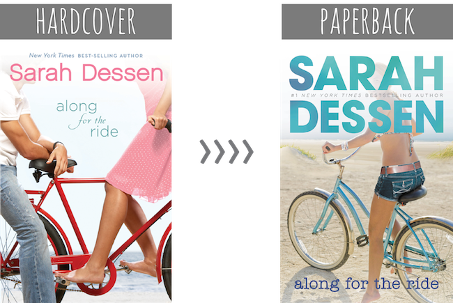
To be honest, I don’t particular prefer one over the other because it’s pretty forgettable, but I do appreciate that Along for the Ride covers have a color theme. For the hardcover, it’s red and for the paperback, it’s turquoise.

Reasons why I like the hardcover:

  • The red bicycle.
  • The title font, especially the “for the” because it adds a nice flair to it.

Reasons why I don’t like the hardcover: 

  • It looks dated. 
  • It doesn’t look summer-y.
  • It looks like it’s about the romance. Sure the romance is a big part of the book, but the story isn’t really about that.
  • I have A LOT of questions about the way the characters are positioned. For instance, how is that bike staying upright when the girl is sitting on the handlebars and the guy is just resting his forearms on the bicycle seat? Wouldn’t the bike fall? And where is the guy’s other leg? Does somebody who lives by the beach really wear jeans and (what appears to be) a white polo? 

Reasons why I like the paperback:

  • Summer themed! You have a girl in a bikini top and shorts on a bike. There’s sand. SUMMER. 
  • The font for “Sarah Dessen.” 
  • The color! Turquoise is one of my favorite colors! 
  • The position of the girl is more believable. 

Reasons why I don’t like the paperback: 

  • The font for Along for the Ride. Just no. It doesn’t compliment the font used for Sarah Dessen. It looks inferior.
  • Where’s the water? It’s so far away in the distance that it makes the sand look like a barren field. 

Which cover design do you prefer? Is there anything you would change in the covers?

(Note: I have yet to change the feature title because I’m still searching for the perfect name. :P.)

Share this:

  • Twitter
  • Facebook
  • Tumblr
  • Pinterest
  • Email

Previous:
REVIEW | The Cavendish Home for Boys and Girls by Claire Legrand
Next:
YOU’RE JUST MY TYPE | {6}

You might also enjoy

Cover Change | If I Stay by Gayle FormanCover Change | If I Stay by Gayle Forman
HOLY, MOTHER COVER! | Changes in The Gameboard of the Gods by Richelle MeadHOLY, MOTHER COVER! | Changes in The Gameboard of the Gods by Richelle Mead
HOLY, MOTHER COVER! • HC vs PB Cover Changes: Frankly in Love by David Yoon

Comments

  1. Nadia @ Nadia Reads says

    March 11, 2014 at 2:07 am

    I generally like the paperback more for all the reasons you said. The one thing that I really hate in all Sarah Dessen books is that her name is written in huge letters and takes over the whole cover, when, in my opinion, the title should be the protagonist on the cover! She dooes that in almost every one of her books!

    Reply
  2. Ashley says

    March 11, 2014 at 7:07 am

    The new one is an improvement! I agree that the “along for the ride” font sucks though.

    Reply
  3. Rachel says

    March 11, 2014 at 9:26 am

    I definitely prefer the paperback (I prefer all the paperback redesigns, actually). The hardcover does look really dated. Did I like it at the time? Absolutely. But design trends change and I think if you’re trying to keep an audience and build it, you have to keep up with these changes. I think the paperback represents the book a lot better and it’s just more appealing to look at.

    Reply
  4. Annie says

    March 11, 2014 at 12:50 pm

    Along For The Ride was actually one of the better old Sarah Dessen covers so I’m (mostly) with you, I don’t really have a particular preference. In general, I do like the newer covers more than the old ones and I guess that kind of applies to this too. I think one of the reasons why I don’t like the old cover as much is because of the jeans the guy’s wearing. *snickers* I always imagine a cowboy hat on top of his head and cowboy boots. Haha. Overall though, I agree with Rachel that the paperback represents the book a lot better.

    Reply
  5. Mari @TheSirenicCodex says

    March 11, 2014 at 1:17 pm

    I agree with Annie that Along for the Ride was one of Dessen’s better covers as well as Lock and Key but then again they are her latest. I wasn’t too sure about the new covers but I get what you mean. It’s definitely summery and I like the colours. I think it’s definitely an improvement but that’s not always the case with cover changes. I really don’t like the new covers for Across the Universe…

    Reply
  6. Nikki @ The Paper Sea says

    March 11, 2014 at 2:34 pm

    I think the paperback is a huge improvement (for all the Sarah Dessen novels, actually). The hardcover is really dated by now and that’s a huge turn-off for me. Like, look at that guy’s jeans! It looks like I’m in the minority, but I like the font for ‘along for the ride’ too…

    Reply
  7. Terri @ Starlight Book Reviews says

    March 12, 2014 at 8:04 am

    I like the redesign, but I wish the title of the book wasn’t so small. Also, for some reason, the lowercase font bothers me. Guess I’m too traditional! I like my proper nouns to be properly capitalized, LOL!

    Reply
  8. Miranda @ Tempest Books says

    March 15, 2014 at 2:13 pm

    I definitely like the re-design better, but I agree with you that the title font was a bad choice. Haha I can’t believe I never noticed the awkward positioning on the first cover. WHERE IS HIS OTHER LEG??

    Reply

Leave a Reply Cancel reply

Your email address will not be published. Required fields are marked *

About Me


I’m Cee. Lover of books + comics. Bookseller. Former teen witch.

The Novel Hermit is written by a daydreamer who loves books and want to share her love with everybody. You will find YA, comics, reviews, discussions, book cover love, and lots of adoration for books. What more can you ask for?

Follow Me

Twitter Facebookg Goodreads Instagram Pinterest E-mail RSS

Recent Posts

  • BOOKS IN HAND • What Readers Bought for the Holidays 2024
  • TOO MUCH TBR • December 2024
  • TOO MUCH TBR • November 2024
  • TOO MUCH TBR • October 2024
  • TOO MUCH TBR • September 2024

ARCHIVES

2024

  • + December (2)
  • + November (1)
  • + October (1)
  • + September (1)
  • + August (1)
  • + July (1)
  • + June (1)
  • + May (1)
  • + April (2)
  • + March (1)
  • + February (1)
  • + January (3)

2023

  • + December (2)
  • + November (2)
  • + October (2)
  • + September (2)
  • + August (2)
  • + July (2)
  • + June (2)
  • + May (4)
  • + April (2)
  • + March (2)
  • + February (3)
  • + January (4)

2022

  • + December (5)
  • + November (3)
  • + October (6)
  • + September (4)
  • + August (4)
  • + July (5)
  • + June (9)
  • + May (8)
  • + April (4)
  • + March (3)
  • + February (2)
  • + January (5)

2021

  • + December (5)
  • + November (1)
  • + October (1)
  • + September (4)
  • + August (4)
  • + July (4)
  • + June (2)
  • + May (3)
  • + April (2)
  • + March (2)
  • + February (3)
  • + January (1)

2020

  • + December (4)
  • + November (1)
  • + October (6)
  • + September (2)
  • + August (3)
  • + May (1)
  • + April (2)
  • + March (4)
  • + February (2)
  • + January (3)

2019

  • + December (4)
  • + November (2)
  • + October (7)
  • + September (3)
  • + August (3)
  • + July (1)
  • + June (4)
  • + May (2)
  • + April (2)
  • + March (1)
  • + February (2)
  • + January (4)

2018

  • + December (3)
  • + November (3)
  • + October (2)
  • + September (3)
  • + August (2)
  • + July (3)
  • + June (2)
  • + May (6)
  • + April (11)
  • + March (9)
  • + February (7)
  • + January (7)

2017

  • + December (5)
  • + November (2)
  • + October (11)
  • + September (14)
  • + August (12)
  • + July (12)
  • + June (9)
  • + May (11)
  • + April (9)
  • + March (13)
  • + February (19)
  • + January (10)

2016

  • + December (9)
  • + November (11)
  • + October (12)
  • + September (15)
  • + August (8)
  • + July (16)
  • + June (15)
  • + May (16)
  • + April (17)
  • + March (18)
  • + February (19)
  • + January (15)

2015

  • + December (15)
  • + November (15)
  • + October (15)
  • + September (17)
  • + August (18)
  • + July (17)
  • + June (14)
  • + May (16)
  • + April (15)
  • + March (14)
  • + February (15)
  • + January (14)

2014

  • + December (14)
  • + November (14)
  • + October (13)
  • + September (11)
  • + August (14)
  • + July (14)
  • + June (14)
  • + May (17)
  • + April (9)
  • + March (18)
  • + February (19)
  • + January (21)

2013

  • + December (18)
  • + November (17)
  • + October (21)
  • + September (18)
  • + August (16)
  • + July (17)
  • + June (15)
  • + May (11)
  • + April (6)
  • + March (7)
  • + February (4)
  • + January (2)

2012

  • + December (2)

Disclaimer

All of the books I review either have been purchased by me, borrowed from the library, and sent to me by the publisher (the latter of which I will note).

All the words and opinions in this blog are my own. I am not paid to write reviews. Synopsis are taken from either the back of the book or from Goodreads.com.

Any use and/or duplication of my material without permission from me (the author and owner of The Novel Hermit blog) is strictly prohibited.

2025 The Novel Hermit. All Rights Reserved. Design by SkyandStars.co
Back Top

Copyright © 2025 · Yoon Theme on Genesis Framework · WordPress · Log in