• Home
  • Reviews
    • Books
    • Comics
  • Features
    • Curation by Cee
    • Holy, Mother Cover!
    • Sincerely, Cee | A letter from yours truly
    • The Three C’s: Candid Conversations with Cee
    • You’re Just My Type | Fonts galore!
  • About
    • FAQ
    • Review Policy
    • Giveaway Policy
  • Contact

The Novel Hermit

daydreaming about books

Holy Mother Cover

HOLY, MOTHER COVER! | She Is Not Invisible by Marcus Sedgwick

July 17, 2014 Comments : 10

holymothercover

Inspired by What She Reads, Pure Imagination Blog, and Stacked.

I admit I’m a book cover snob. Who isn’t though?

Book covers are the first thing that attracts readers to a book. A good cover can draw someone is, just as a bad cover can easily draw someone away. It can essentially make or break a book. Holy, Mother Cover! is where I showcase the book covers that stand out (or make me cringe), and discuss cover changes.

(A big special thanks to Georgie at What She Reads for bestowing me this fabulous name and to Charlotte at Gypsy Reviews for creating the beautiful feature banner you see before you.)

border

COVER DIFFERENCES: She Is Not Invisible by Marcus Sedgwick

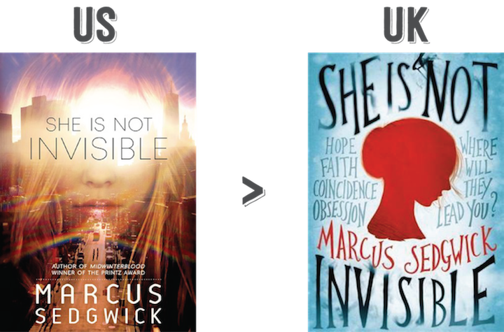
[row][column size=”1/2″]What do I think about the cover design? I don’t know if you can hear the heavy sigh coming from my mouth. I am disappointed that the US cover of She Is Not Invisible isn’t that great. I’m honestly not surprised either.

I dislike how the girl’s face is layered on top of a picture of a city. I get that it’s sort of emphasizing the title—that the girl isn’t invisible and that you can see her on the cover even if she looks like she’s fading. However, it just looks amateur-ly put together. And the font for the book title is not a great look, especially compared to the font used for “Marcus Sedgwick.”

The two things I really like on the cover are: 1. the sun lens flare (it’s blinding almost as if it’s referring to how the main character is blind, and shedding light.) and 2. the font used for the author’s name (I am into the sharp angles for the curves in the letters. It makes me think of hexagons).

Would I buy this book based on the cover? Nah. I’ll pass.[/column] [column size=”1/2″]What do I think about the cover design? Guess who’s in love with this cover? THIS GIRL, RIGHT HERE.

I’m extremely envious that the UK gets this amazingly gorgeous cover. Just look at that! The typography, guys! So beautiful. The coloring and the lettering make the cover stand out to me. I love the smoky effect of the lettering, almost like it’ll disappear. Whoever designed this cover made good use of the space by wrapping the lettering around the orangey-red silhouette girl. It doesn’t look too crowded or overwhelming. The lettering looks like it was made for this cover, and I love that! And the silhouette with the wisps of hair hanging down is such a great detail. The girl isn’t all prim and proper.

The blurring around the edges of the book bothers me a bit because I just want the typography to be crystal clear, but it’s a nice effect and it does somewhat fit with the synopsis.

Would I buy this book based on the cover? Yes, yes I would.[/column][/row]

When I look at the two covers and think about the synopsis, the US cover does make sense; it tells you this is a contemporary story and emphasizes on the “light,” but it’s not visually pleasing to me. I will always pick the UK cover because I love me some gorgeous typography even if it doesn’t really tell me anything about the book. ;D

Which cover design do you prefer? Would you buy the US or the UK one? How do you like how this post is formatted?

Share this:

  • Click to share on X (Opens in new window) X
  • Click to share on Facebook (Opens in new window) Facebook
  • Click to share on Tumblr (Opens in new window) Tumblr
  • Click to share on Pinterest (Opens in new window) Pinterest
  • Click to email a link to a friend (Opens in new window) Email

Previous:
TOP TEN TUESDAY | TV Shows I Love With Awesome Friendships!
Next:
YOU’RE JUST MY TYPE | {16}

You might also enjoy

HOLY, MOTHER COVER! | US vs UK: My Heart and Other Black Holes by Jasmine WargaHOLY, MOTHER COVER! | US vs UK: My Heart and Other Black Holes by Jasmine Warga
HOLY, MOTHER COVER! HC vs PB • Sex and Vanity by Kevin Kwan
HOLY, MOTHER COVER | Trend: DollsHOLY, MOTHER COVER | Trend: Dolls

Comments

  1. Rosie // Rosie Reads says

    July 17, 2014 at 5:36 pm

    I’m taking a break from my 2,000-word photo prompt to say YES. YES TO EVERYTHING YOU SAID.
    It seems US covers are getting worse and UK covers are getting better D:
    I like how colorful the cover is and how smoky and beautiful the font is in the UK cover! I would definitely buy it based on the cover alone.

    Reply
  2. Asti says

    July 18, 2014 at 1:15 am

    I agree with you, the UK cover is definitely prettier. So eye-catching! But I have sad news! The UK paperback for this one? It’s the US cover. I don’t know why they decided the original wasn’t good enough. I think someone said it’s not as representative of the story as the other one? But meh. I’m not a fan. I’m glad I have a copy of the hardback version!

    Reply
  3. Mel@thedailyprophecy says

    July 18, 2014 at 1:25 am

    I’m not a fan of both covers, but if I would get one I would go for the UK one! I’m not a fan of floating faces.

    Reply
  4. Annie says

    July 18, 2014 at 8:45 am

    Like Mel, I’m not a huge fan of either cover but I definitely think the UK one looks a lot nicer than the US one. The US cover just looks extremely busy to me with the layering and effects and while the UK cover isn’t my favourite cover ever, it is pretty! I would not hesitate to buy the UK cover over the US cover at all!

    Reply
  5. Nikki @ The Paper Sea says

    July 18, 2014 at 8:53 am

    I don’t have a strong preference for either cover, really, although if push came to shove I’d be more inclined to go with the UK cover; it’s just that bit more unique. But I was in Waterstones today, and they were stocking the US cover! I’m not really sure why, since this is, you know, the UK!

    Reply
  6. Rebecca says

    July 18, 2014 at 11:23 pm

    I’m not someone who’s visually minded but I do usually have a cover preference. I do have to say that I’m not the biggest fan of either cover. Funnily enough, when I looked at the covers my first reaction was to be drawn to the US cover. I think I like it a little bit more than the UK edition just because I like the colours on that one more than I do on the UK cover.

    Reply
  7. Kaitlin @ Reading is My Treasure says

    July 19, 2014 at 12:29 am

    I LOVE the UK cover! I first saw it on a blog post among a bunch of others and it just stuck out to me. It draws the eye to it. That cover makes the book look amazing. The US one makes it look . . . mediocre. There’s a big difference on the impressions each leave on me.

    Reply
  8. Lipsy says

    July 19, 2014 at 3:48 am

    I definitely prefer the UK cover! I saw that US version in a shop over here (I’m in London, Hi!) the other day and that’s one of the reasons I didn’t buy it. I mean, it’s not awful, I kinda like the colours, but other one just looks cooler.

    Reply
  9. Georgie @ What She Reads says

    July 20, 2014 at 1:53 am

    Oh my Cee, you should see the physical hardback of the UK cover it is so lovely, the texture is a soft matte and yeah totally amazing. I don’t quite understand why there has to be two different sans-serif typefaces on the US cover, surely just pick one and use the different variations it offers?

    Reply

Leave a Reply Cancel reply

Your email address will not be published. Required fields are marked *

About Me


I’m Cee. Lover of books + comics. Bookseller. Former teen witch.

The Novel Hermit is written by a daydreamer who loves books and want to share her love with everybody. You will find YA, comics, reviews, discussions, book cover love, and lots of adoration for books. What more can you ask for?

Follow Me

Twitter Facebookg Goodreads Instagram Pinterest E-mail RSS

Recent Posts

  • MUSIC TO MY (Y)EAR • 2024
  • BOOKS IN HAND • What Readers Bought for the Holidays 2024
  • TOO MUCH TBR • December 2024
  • TOO MUCH TBR • November 2024
  • TOO MUCH TBR • October 2024

ARCHIVES

2025

  • – June (1)
    • MUSIC TO MY (Y)EAR • 2024

2024

  • + December (2)
  • + November (1)
  • + October (1)
  • + September (1)
  • + August (1)
  • + July (1)
  • + June (1)
  • + May (1)
  • + April (2)
  • + March (1)
  • + February (1)
  • + January (3)

2023

  • + December (2)
  • + November (2)
  • + October (2)
  • + September (2)
  • + August (2)
  • + July (2)
  • + June (2)
  • + May (4)
  • + April (2)
  • + March (2)
  • + February (3)
  • + January (4)

2022

  • + December (5)
  • + November (3)
  • + October (6)
  • + September (4)
  • + August (4)
  • + July (5)
  • + June (9)
  • + May (8)
  • + April (4)
  • + March (3)
  • + February (2)
  • + January (5)

2021

  • + December (5)
  • + November (1)
  • + October (1)
  • + September (4)
  • + August (4)
  • + July (4)
  • + June (2)
  • + May (3)
  • + April (2)
  • + March (2)
  • + February (3)
  • + January (1)

2020

  • + December (4)
  • + November (1)
  • + October (6)
  • + September (2)
  • + August (3)
  • + May (1)
  • + April (2)
  • + March (4)
  • + February (2)
  • + January (3)

2019

  • + December (4)
  • + November (2)
  • + October (7)
  • + September (3)
  • + August (3)
  • + July (1)
  • + June (4)
  • + May (2)
  • + April (2)
  • + March (1)
  • + February (2)
  • + January (4)

2018

  • + December (3)
  • + November (3)
  • + October (2)
  • + September (3)
  • + August (2)
  • + July (3)
  • + June (2)
  • + May (6)
  • + April (11)
  • + March (9)
  • + February (7)
  • + January (7)

2017

  • + December (5)
  • + November (2)
  • + October (11)
  • + September (14)
  • + August (12)
  • + July (12)
  • + June (9)
  • + May (11)
  • + April (9)
  • + March (13)
  • + February (19)
  • + January (10)

2016

  • + December (9)
  • + November (11)
  • + October (12)
  • + September (15)
  • + August (8)
  • + July (16)
  • + June (15)
  • + May (16)
  • + April (17)
  • + March (18)
  • + February (19)
  • + January (15)

2015

  • + December (15)
  • + November (15)
  • + October (15)
  • + September (17)
  • + August (18)
  • + July (17)
  • + June (14)
  • + May (16)
  • + April (15)
  • + March (14)
  • + February (15)
  • + January (14)

2014

  • + December (14)
  • + November (14)
  • + October (13)
  • + September (11)
  • + August (14)
  • + July (14)
  • + June (14)
  • + May (17)
  • + April (9)
  • + March (18)
  • + February (19)
  • + January (21)

2013

  • + December (18)
  • + November (17)
  • + October (21)
  • + September (18)
  • + August (16)
  • + July (17)
  • + June (15)
  • + May (11)
  • + April (6)
  • + March (7)
  • + February (4)
  • + January (2)

2012

  • + December (2)

Disclaimer

All of the books I review either have been purchased by me, borrowed from the library, and sent to me by the publisher (the latter of which I will note).

All the words and opinions in this blog are my own. I am not paid to write reviews. Synopsis are taken from either the back of the book or from Goodreads.com.

Any use and/or duplication of my material without permission from me (the author and owner of The Novel Hermit blog) is strictly prohibited.

2025 The Novel Hermit. All Rights Reserved. Design by SkyandStars.co
Back Top

Copyright © 2025 · Yoon Theme on Genesis Framework · WordPress · Log in