• Home
  • Reviews
    • Books
    • Comics
  • Features
    • Curation by Cee
    • Holy, Mother Cover!
    • Sincerely, Cee | A letter from yours truly
    • The Three C’s: Candid Conversations with Cee
    • You’re Just My Type | Fonts galore!
  • About
    • FAQ
    • Review Policy
    • Giveaway Policy
  • Contact

The Novel Hermit

daydreaming about books

Holy Mother Cover

HOLY, MOTHER COVER! | Changes in The Lucy Variations by Sara Zarr

August 10, 2014 Comments : 8

holymothercover

Inspired by What She Reads, Pure Imagination Blog, and Stacked.

I admit I’m a book cover snob. Who isn’t though?

Book covers are the first thing that attracts readers to a book. A good cover can draw someone is, just as a bad cover can easily draw someone away. It can essentially make or break a book. Holy, Mother Cover! is where I showcase the book covers that stand out (or make me cringe), and discuss cover changes.

(A big special thanks to Georgie at What She Reads for bestowing me this fabulous name and to Charlotte at Gypsy Reviews for creating the beautiful feature banner you see before you.)

border

COVER CHANGE: The Lucy Variations by Sara Zarr

[row][column size=”1/2″]What do I think about the cover design? I don’t like it. Not at all.

Sure, the picture of the hand and the piano are perfect for the book since it is about a pianist, but the font, the font hurts me. The title font is so out of place. It doesn’t complement the font for the author, nor does it use the spacing at the top very well. I also don’t like the white glow around “Sara Zarr” because the glow draws my attention to it (not to the author’s name itself).

Plus, the font color of the title doesn’t match the font color of the author. In every cover image I’ve seen of this book, the coloring is completely off. It’s either too light purple or a pink color (like the one above), and none of those covers works with the purple.

Would I buy this book based on the cover? Noppppeeee.[/column] [column size=”1/2″]What do I think about the cover design? Again, FONT ISSUE. Ugh.

The font in this is worse than the hardcover one. (I sighed so loud when I saw it.) It’s very stiff, and looks extremely outdated because of the shadows. It just screams early 2000s to me. The shadows would kind of work if it wasn’t pink. The problem is that the color tone of the entire cover is already a bit magenta; the pink shadows blends into the picture, hiding itself in the pink dress, in the dark stone, and in the overly magenta skin tone. That’s a big no-no if you want the title to stand out on its own.

Also, the cover picture doesn’t tell me anything about the book. At least with the hardcover, it shows a piano. This cover is like any other book with a girl having fun.

Would I buy this book based on the cover? Never.[/column][/row]

But who’s the real winner?
unveil cover

And the winner is....
Surpriseeeeee! Not at all what you expected, right? This version of The Lucy Variations is the best. Reasons why:

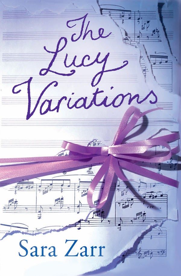
  • Sheet music! I love that it’s torn. It’s a really perfect way of showing that this book is about music.
  • The font for the title! It fits perfectly. Plus, I love that it kind of looks like it was written in pastel.
  • The purple ribbons! All wrapped together nicely like a present.

My only issue with this cover is the font choice and color of “Sara Zarr.” It doesn’t fit with the overall cover, but it’s not a huge deal breaker.

Which cover design do you prefer? Would you buy the US or the UK one? How do you like how this post is formatted?

Share this:

  • Twitter
  • Facebook
  • Tumblr
  • Pinterest
  • Email

Previous:
SINCERELY, CEE | A letter from yours truly to A Darker Shade of Magic
Next:
TOP TEN TUESDAY | To Read or Not To Read?

You might also enjoy

HOLY, MOTHER COVER! | Cover Change in Perfect Ruin by Lauren DeStefanoHOLY, MOTHER COVER! | Cover Change in Perfect Ruin by Lauren DeStefano
HOLY, MOTHER COVER! | Changes in The Gameboard of the Gods by Richelle MeadHOLY, MOTHER COVER! | Changes in The Gameboard of the Gods by Richelle Mead
HOLY, MOTHER COVER! US vs UK • Ariadne & Elektra by Jennifer SaintHOLY, MOTHER COVER! US vs UK • Ariadne & Elektra by Jennifer Saint

Comments

  1. Tracey @PrintedWordsAnd says

    August 10, 2014 at 6:44 am

    That was definitely a surprise! I can see what you mean, it’s more simplistic and easier on the eyes. Great choice :)

    Reply
  2. Lori L. Clark says

    August 10, 2014 at 6:53 am

    I just found your blog yesterday via pinterest and your font posts. :) I like the hidden cover the best. The first cover is nice, but the font is awful.

    Reply
  3. Charlotte @ Gypsy Reviews says

    August 10, 2014 at 7:29 am

    WOW. WHAT A PLOT TWIST UH HUH.

    Idk I think for the hardcover I might have to disagree with you. Apart from the font for the author, I prefer the simplicity of the photo. I like that the font title brings a certain elegance to the cover and the colour scheme, although a bit odd, it still sort of matches (I just noticed the fingernails are pink lol). You should definitely see the under the jacket spine though because that is pretty with the font title and little musical notes around it.

    Blergh the paperback is a huge mess. What is up with that font and the effect of the shadow is just jarring. It says nothing about the book at all either because knowing that the book is linked to music or the piano could actually entice more readers (tbh that’s what made me read this book in the first place). This is a cover that’s going to get lost in the many other contemporary covers out there.

    I’ve never seen the UK cover until today actually but I do like it. I think I’m still more partial to the hardcover because the font for the author name in the UK cover is too much for me to ignore. But I do love the font used for the title and the concept of the cover really fits the story well.

    Reply
  4. Kayla @ The Thousand Lives says

    August 10, 2014 at 2:09 pm

    Ooohh I was not expecting that one! I’d totally buy the book based on that third cover :D Although I think I’d get the paperback if I had to pick between the first two. It’s *slightly* better. But still: the font.

    Reply
  5. Kay @ It's a Book Life says

    August 11, 2014 at 9:27 am

    I think your choice would be my choice as well, although the Hardcover one isn’t too bad. The font is just to painful to my eyes on the paperback!

    Reply
  6. Miranda @ Tempest Books says

    August 12, 2014 at 2:29 am

    Ooh I really like that third cover! I’m with you…both the hardcover and paperback are awful. It’s like the person who designed knows nothing about fonts or spacing or anything! Ugh

    Reply
  7. Chloe @ YA Booklover Blog says

    August 12, 2014 at 7:31 am

    I really like the third cover you revealed! But the other two… nope. The first one looks like something you could create on Microsoft Word, it just looks so bleh.

    Reply
  8. Nikki @ The Paper Sea says

    August 25, 2014 at 6:54 am

    Oooh, fancy new technique to reveal the winner! I like! :D I agree with all your analysis. The hidden cover is 100% superior!

    Reply

Leave a Reply Cancel reply

Your email address will not be published. Required fields are marked *

About Me


I’m Cee. Lover of books + comics. Bookseller. Former teen witch.

The Novel Hermit is written by a daydreamer who loves books and want to share her love with everybody. You will find YA, comics, reviews, discussions, book cover love, and lots of adoration for books. What more can you ask for?

Subscribe to Blog via Email

If you want to read more of my reviews and book cover discussions, or you want a narwhal to appear in your dreams, subscribe by email here!

Follow Me

Twitter Facebookg Goodreads Instagram Pinterest E-mail RSS

Recent Posts

  • BOOKS IN HAND • What Customers Are Buying in February 2023
  • TOO MUCH TBR • March 2023
  • CURATION BY CEE • Galentine’s Day: Books with Female Friendships!
  • TOO MUCH TBR • February 2023
  • BOOKS IN HAND • What Customers Are Buying in January 2023

ARCHIVES

2023

  • – March (2)
    • BOOKS IN HAND • What Customers Are Buying in February 2023
    • TOO MUCH TBR • March 2023
  • + February (3)
  • + January (4)

2022

  • + December (5)
  • + November (3)
  • + October (6)
  • + September (4)
  • + August (4)
  • + July (5)
  • + June (9)
  • + May (8)
  • + April (4)
  • + March (3)
  • + February (2)
  • + January (5)

2021

  • + December (5)
  • + November (1)
  • + October (1)
  • + September (4)
  • + August (4)
  • + July (4)
  • + June (2)
  • + May (3)
  • + April (2)
  • + March (2)
  • + February (3)
  • + January (1)

2020

  • + December (4)
  • + November (1)
  • + October (6)
  • + September (2)
  • + August (3)
  • + May (1)
  • + April (2)
  • + March (4)
  • + February (2)
  • + January (3)

2019

  • + December (4)
  • + November (2)
  • + October (7)
  • + September (3)
  • + August (3)
  • + July (1)
  • + June (4)
  • + May (2)
  • + April (2)
  • + March (1)
  • + February (2)
  • + January (4)

2018

  • + December (3)
  • + November (3)
  • + October (2)
  • + September (3)
  • + August (2)
  • + July (3)
  • + June (2)
  • + May (6)
  • + April (11)
  • + March (9)
  • + February (7)
  • + January (7)

2017

  • + December (5)
  • + November (2)
  • + October (11)
  • + September (14)
  • + August (12)
  • + July (12)
  • + June (9)
  • + May (11)
  • + April (9)
  • + March (13)
  • + February (19)
  • + January (10)

2016

  • + December (9)
  • + November (11)
  • + October (12)
  • + September (15)
  • + August (8)
  • + July (16)
  • + June (15)
  • + May (16)
  • + April (17)
  • + March (18)
  • + February (19)
  • + January (15)

2015

  • + December (15)
  • + November (15)
  • + October (15)
  • + September (17)
  • + August (18)
  • + July (17)
  • + June (14)
  • + May (16)
  • + April (15)
  • + March (14)
  • + February (15)
  • + January (14)

2014

  • + December (14)
  • + November (14)
  • + October (13)
  • + September (11)
  • + August (14)
  • + July (14)
  • + June (14)
  • + May (17)
  • + April (9)
  • + March (18)
  • + February (19)
  • + January (21)

2013

  • + December (18)
  • + November (17)
  • + October (21)
  • + September (18)
  • + August (16)
  • + July (17)
  • + June (15)
  • + May (11)
  • + April (6)
  • + March (7)
  • + February (4)
  • + January (2)

2012

  • + December (2)

Disclaimer

All of the books I review either have been purchased by me, borrowed from the library, and sent to me by the publisher (the latter of which I will note).

All the words and opinions in this blog are my own. I am not paid to write reviews. Synopsis are taken from either the back of the book or from Goodreads.com.

Any use and/or duplication of my material without permission from me (the author and owner of The Novel Hermit blog) is strictly prohibited.

2023 The Novel Hermit. All Rights Reserved. Design by SkyandStars.co
Back Top

Copyright © 2023 · Yoon Theme on Genesis Framework · WordPress · Log in