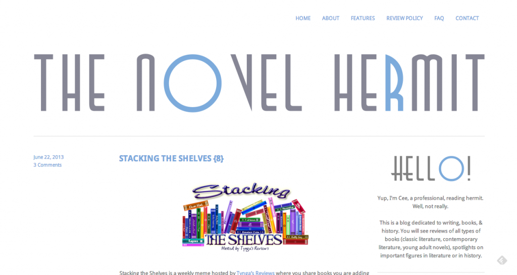
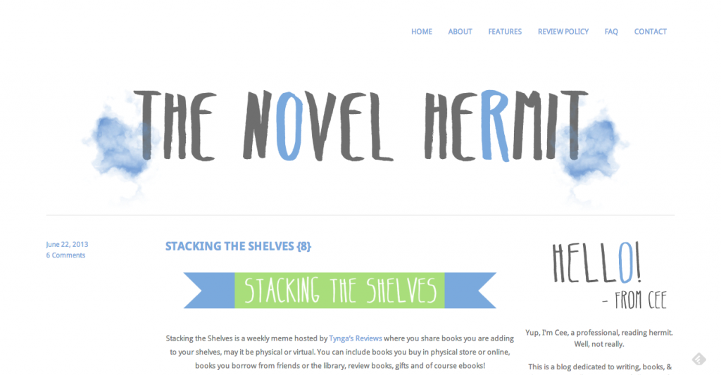
See, I have followed through on my desire to redesign my header. I am very pleased at the results.
Here is what it used to look:

And here it is now:

Ahhh, what a difference!. It’s gorgeous. Maybe because it’s new. New things always make me giddy. (I’m sure I’ll be sick of it a few months from now.)
Now, it’s time for a Q & A about the changes.
Why did you want a change?
I got tired of looking at my header. To me, it looked…stiff and impersonal all of a sudden. I felt that the typeface of my old banner was dated, and that it didn’t fit with the books I’ve been reading. It felt awkward and unnatural. I wanted something more fun and, in a sense, more representative of me…now.
What did you change?
The colors I used and the layout is still the same. I wanted to maintain the cleanliness and simplicity of the two, so I didn’t change that. I redesigned the header and the weekly meme images. The weekly meme images used to be circles, but I changed it for flags because it didn’t take as much space. (Although, I might change the flags for squares with rounded corners. We’ll see.) I changed the “hello” in the sidebar and the social networking icons.
Tell us about your header.
My blog name is “The Novel Hermit.” I wanted my header to be simple, and not glaring/annoying to look at. On the sides of the name, I placed a blur of blue, which is actually a watercolor image of a hermit image. It was accidental – the watercolor. I had always intended to find a hermit image (to reflect my name) and I found a hermit image in the typeface – “SeaLife.” When I placed it next to the name, it looked awkward because it was too sharp/clean cut, so I began messing with the filters on Inkscape, seeing which one would soften the hermit image. And voila!
What typeface is your header?
Belta Bold! Everything else (the images) are in Belta Regular.
I really love it. When I first saw it over at Carrie Loves, I fell in love with it. I knew that was what I wanted to use for the typeface of my header.
Who made it?
I did! For someone with no artistic talent whatsoever, I did well.
And now, I have a question for all of you, my readers: how do you like the new header? Thoughts? Criticisms? Questions?


I like it! It’s cute, and pretty ^.^
Cute!! This layout def seems more personal.
The change is so subtle but I like it because it seems like you wrote it. haha. Such a clean, simple layout. Exactly how I like it! Awesome job!
I love the changes, beautiful!
Thank you for sharing about the differences-I tend to be really bad at noticing differences unless they’re HUGE (like a completely different color palette that ruined your clean look).