
Inspired by What She Reads, Pure Imagination Blog, and Stacked.
I admit I’m a book cover snob. Who isn’t though?
Book covers are the first thing that attracts readers to a book. A good cover can draw someone is, just as a bad cover can easily draw someone away. It can essentially make or break a book. Holy, Mother Cover! is where I showcase the book covers that stand out (or make me cringe), and discuss cover changes.
(A big special thanks to Georgie at What She Reads for bestowing me this fabulous name and to Charlotte at The Simple Tales for creating the beautiful feature banner you see before you.)
COVER CHANGE: Vanishing Girls by Lauren Oliver
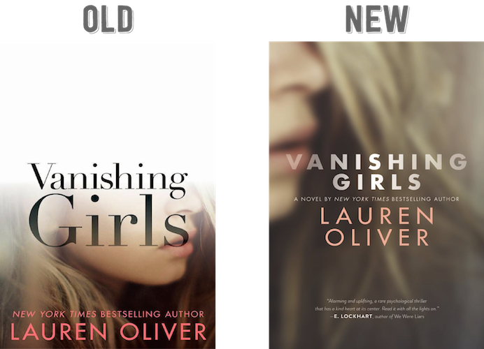
It’s that white at the top. It’s an awesome effect that emphasizes the title name and the plot of the book, but the transition from the white to the picture of the girl isn’t a smooth one. It’s a bit jarring. It bothers me that you can essentially see where the line between white and the picture is. I’d prefer if it had a fading effect, so it looks like a gradual, but natural transition. Also, the pink for “Lauren Oliver” is a bit too bright; I’d like it better if it was muted.
Enough of what I don’t like, let’s talk what I do. I like the fading effect of the title—the black to a more transparent black—since it’s reflecting the title, and I like how “Vanishing” is sitting in the white area.
Would I buy this book based on the cover? No.[/column] [column size=”1/2″]What do I think about the cover design? It’s slightly better?
No more chunk of white! So yay! I am satisfied now that’s gone because oh man, it was bad. Not this cover though. I like that this cover keeps the fading effect. The picture is the same as the previous one, but it’s cropped differently so only her nose and mouth can be seen. Instead of the picture fading to white, the picture is blurred, fading away until it’ll eventually become unclear and vanish from your eyes. The title is given the fading effect also, which I really like. It looks like it’s vanishing more than on the previous look of the title.
I don’t know if this would be better, but I want to see the title and the author name fade starting from the top to down. Almost like in the previous cover.
Would I buy this book based on the cover? Sure.[/column][/row]
Final Verdict: The new cover.


Love the new cover! I really didn’t like that huge chunk of white space in the original.
I like the new cover as well. The fading white on the first one definitely could have been done better, and I like that the title on the new cover is more transparent than the first!
I like the new cover too! The old cover always looked awkward with the huge white space on the top, but with more fading it looks a lot better.
Oh wow the old cover is really bad. The new cover is better for sure. Like you said, I like the blur effect and how it doesn’t have a lot of white.
The new cover is a lot better. The line of white bothered me too. This cover though, it’s perfect. It still captures the mysterious aspect while keeping the original picture, which I loved. I love blur effects, I agree with you about the font, I wish the fading was fading from the top. The way it is now, immediate attention seems to go right to the “sr”.
I like the old cover more! It’s very interesting that they made the cover look like it was “vanishing” itself. It’s a really creative cover for a great book, I’m sure. The new cover doesn’t look as engaging and a little boring.. I wouldn’t even notice it if I walked by it in a book store.
I’d buy either… lol… it’s Lauren’s story I’m after.
Which one do I think is more appealing? The new one, definitely.
I think the new cover is stunning! The old one kind of gives me a headache :/
I like the new one better, but I’m not really a fan of either one of them to be honest. Getting rid of the white was a vast improvement though.