• Home
  • Reviews
    • Books
    • Comics
  • Features
    • Curation by Cee
    • Holy, Mother Cover!
    • Sincerely, Cee | A letter from yours truly
    • The Three C’s: Candid Conversations with Cee
    • You’re Just My Type | Fonts galore!
  • About
    • FAQ
    • Review Policy
    • Giveaway Policy
  • Contact

The Novel Hermit

daydreaming about books

Holy Mother Cover

JUDG(ING) A BOOK BY ITS COVER | The case of Born Wicked by Jessica Spotswood

February 7, 2014 Comments : 12

judgingabookbyitscoverSTpng

Inspired by Pure Imagination Blog and Stacked.

Let’s be honest, nobody follows the age-old cliché that tells us not to judge a book by its covers. If you say you do, I am side-eying you. Book covers are the first thing that attracts any of us readers to a book. Before you pick up a book, the cover can essentially make or break a book. If I don’t like a cover design, I won’t pick it up. Lucky for us, publishing companies publish different cover designs, especially when a paperback book comes out. Sometimes we like it, sometimes we don’t. Let’s discuss these cover changes, shall we?

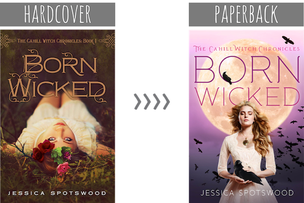
Today, we look at the cover of Born Wicked (The Cahill Witch Chronicles #1) by Jessica Spotswood!


Hmmm, I’m not particular against or for the cover change in Born Wicked.

What I love about the hardcover of Born Wicked is the decorative embellishments in the title. I like how it looks like vines are emerging from certain letters. It fits with the nature-esque theme of the cover. (Y’know, every time I see a flower crown, I want one.) I actually haven’t read the book, but the cover makes me think that nature plays a part in it. (I hope it does). The coloring of the overall cover is a bit dark and muted. It doesn’t make the book all that exciting. If I saw this on a bookshelf, it wouldn’t grab at my attention, whereas, if I saw the paperback, I would be more inclined to pick it up.

The paperback of Born Wicked really captures my attention. I love that the purplish-pink color grabs at me. It’s a great color that doesn’t overpower the image. If anything, it adds to it. The moon frames the model beautifully. It’s bright and glowing. It makes me think that the night is when witches come out to play. I like the usage of the crows, especially the one chilling inside the ‘O’ and the one in the model’s hand. It’s a sign that bad things will happen in the book. The model with her hair billowing in the background looks like she’s trying to summon something (just like a witch would). ;D And her dress, you guys. It’s so gorgeous. The detail on it, gahh! Get on my body!

Which cover design do you prefer? Is there anything you would change in it?

Share this:

  • Twitter
  • Facebook
  • Tumblr
  • Pinterest
  • Email

Previous:
THE THREE C’S: CANDID CONVERSATIONS WITH CEE | Alias Confessions
Next:
REVIEW | The Little Android (The Lunar Chronicles #2.5) by Marissa Meyer

You might also enjoy

HOLY, MOTHER COVER! | Portrait Silhouette ThemeHOLY, MOTHER COVER! | Portrait Silhouette Theme
HOLY, MOTHER COVER! • US vs UK: Loveless by Alice OsemanHOLY, MOTHER COVER! • US vs UK: Loveless by Alice Oseman
HOLY, MOTHER COVER! | Theme: Post-It Notes!HOLY, MOTHER COVER! | Theme: Post-It Notes!

Comments

  1. Charlotte @ Gypsy Reviews says

    February 7, 2014 at 6:21 pm

    Although I do like the tone of the first cover, the second one is more striking with the contrast of the colours and the typography is much nicer. I do like the use of the crows too!

    Reply
  2. Missie says

    February 7, 2014 at 7:55 pm

    I like the hardcover version a lot better!

    Reply
  3. Alexa S. says

    February 7, 2014 at 9:45 pm

    I really like the original cover of this series! There’s just something striking and pretty and… dark about it. Makes it feel more witchy, in my opinion!

    Reply
  4. Amber @ Books of Amber says

    February 8, 2014 at 2:13 am

    I’m definitely way, way against the cover change. I think the new one is absolutely appalling compared to the beauty that they had to begin with. I just don’t think the new one’s details mesh very well together :(

    Reply
  5. Ashley says

    February 8, 2014 at 4:13 am

    I think the paperback looks very typical. I feel like a girl against a full moon has been done before and it isn’t that interesting. It also feels like it has more of a “Photoshopped” look. But I love the colours and angles in the hardcover. I think it’s more aesthetically pleasing and the odd angles make it more unique. Plus I love the typography!

    Reply
  6. Nuzaifa @ Say It with Books says

    February 8, 2014 at 8:46 am

    If I saw both copies on the shelf I think I’d pick the hardcover one. Why? The paperback version is typical Paranormal Romance/UF so it doesn’t really stand out. Very very forgettable. On the other hand, the hardcover one wins both font-wise and image-wise.

    Reply
  7. BornBookish says

    February 8, 2014 at 1:57 pm

    There is no contest in my mind. The hardcover is way better. The image, typography, and embellishments are so pretty and much more complex. The paperback looks super tacky and like a million other book covers out there.

    Reply
  8. Alex @ Life in the Pages says

    February 8, 2014 at 2:12 pm

    I personally like the second cover much better. I remember seeing the hardcover originally and not really being drawn to it. But when I saw the second cover, I immediately had to pick it up and see what it was about. I didn’t even realize that it was the same book!

    Reply
  9. Leigh @ Little Book Star says

    February 8, 2014 at 3:20 pm

    This is a tough one! I agree how the hardback has a pretty font and it seems like they are vines forming into letters, but I also love the paperback edition. I’m a sucker for purplish/pinkish cover and that moon is just perfectly placed there haha. It gives it the “witch” vibe. Hmm, so I think the paperback is a win for me.

    Reply
  10. Chiara @ Books for a Delicate Eternity says

    February 8, 2014 at 11:02 pm

    I definitely think that the hardcover version is more unique. It’s actually one of my favourites. I love the earthy tones, and like you, it makes me think that nature plays a part in the story. I haven’t read this book, but the hardcover cover design makes me want to buy it, just so I can have that gorgeous cover on my shelf.
    The paperback is pretty meh for me, though. I think it’s pretty, but it just doesn’t grab my attention like the first one. I do like the girl’s hair, and her dress, but I think the boring font used for the title lets the cover down, unfortunately.

    Reply
  11. Aimee says

    February 10, 2014 at 3:24 am

    I absolutely love the paperback cover.

    I don’t really have anything against the hardcover–I mean, it has its good points. I like how the only part about the image that isn’t blurred is the girl’s face, which is kind of focused in that one. I actually do kind of like the brown-ness of the cover. I do like the designs on the title (as well as the swirly things beside the series name), but the fonts themselves are unappealing to me.

    For the paperback one, I love the fonts and the overall editing. The background’s a simple purple gradient, with the bright moon makes it eye-catching. I also have a thing for titles slightly covered by the model/any object in the cover. It’s an odd fetish I have, I guess. I also love the model’s posture. And, of course, like you said, the crows are pretty awesome.

    Reply
  12. Georgie @ What She Read says

    February 16, 2014 at 5:53 am

    I have the Paperback version and it’s so pretty. I love how the colours stand out and IRL they are very vibrant. I love the little kick detail on the font too, it just adds something extra to the cover.

    The Hardback is rather beautiful too. I love anything to do with flowers and I’m a bit of a fan of the font, I would like to see what it looks like in real life.

    Reply

Leave a Reply Cancel reply

Your email address will not be published. Required fields are marked *

About Me


I’m Cee. Lover of books + comics. Bookseller. Former teen witch.

The Novel Hermit is written by a daydreamer who loves books and want to share her love with everybody. You will find YA, comics, reviews, discussions, book cover love, and lots of adoration for books. What more can you ask for?

Subscribe to Blog via Email

If you want to read more of my reviews and book cover discussions, or you want a narwhal to appear in your dreams, subscribe by email here!

Follow Me

Twitter Facebookg Goodreads Instagram Pinterest E-mail RSS

Recent Posts

  • TOO MUCH TBR • November 2023
  • BOOKS IN HAND • What Customers Are Buying in October 2023
  • TOO MUCH TBR • October 2023
  • BOOKS IN HAND • What Books Customers Bought in September 2023
  • TOO MUCH TBR • September 2023

ARCHIVES

2023

  • + November (2)
  • + October (2)
  • + September (2)
  • + August (2)
  • + July (2)
  • + June (2)
  • + May (4)
  • + April (2)
  • + March (2)
  • + February (3)
  • + January (4)

2022

  • + December (5)
  • + November (3)
  • + October (6)
  • + September (4)
  • + August (4)
  • + July (5)
  • + June (9)
  • + May (8)
  • + April (4)
  • + March (3)
  • + February (2)
  • + January (5)

2021

  • + December (5)
  • + November (1)
  • + October (1)
  • + September (4)
  • + August (4)
  • + July (4)
  • + June (2)
  • + May (3)
  • + April (2)
  • + March (2)
  • + February (3)
  • + January (1)

2020

  • + December (4)
  • + November (1)
  • + October (6)
  • + September (2)
  • + August (3)
  • + May (1)
  • + April (2)
  • + March (4)
  • + February (2)
  • + January (3)

2019

  • + December (4)
  • + November (2)
  • + October (7)
  • + September (3)
  • + August (3)
  • + July (1)
  • + June (4)
  • + May (2)
  • + April (2)
  • + March (1)
  • + February (2)
  • + January (4)

2018

  • + December (3)
  • + November (3)
  • + October (2)
  • + September (3)
  • + August (2)
  • + July (3)
  • + June (2)
  • + May (6)
  • + April (11)
  • + March (9)
  • + February (7)
  • + January (7)

2017

  • + December (5)
  • + November (2)
  • + October (11)
  • + September (14)
  • + August (12)
  • + July (12)
  • + June (9)
  • + May (11)
  • + April (9)
  • + March (13)
  • + February (19)
  • + January (10)

2016

  • + December (9)
  • + November (11)
  • + October (12)
  • + September (15)
  • + August (8)
  • + July (16)
  • + June (15)
  • + May (16)
  • + April (17)
  • + March (18)
  • + February (19)
  • + January (15)

2015

  • + December (15)
  • + November (15)
  • + October (15)
  • + September (17)
  • + August (18)
  • + July (17)
  • + June (14)
  • + May (16)
  • + April (15)
  • + March (14)
  • + February (15)
  • + January (14)

2014

  • + December (14)
  • + November (14)
  • + October (13)
  • + September (11)
  • + August (14)
  • + July (14)
  • + June (14)
  • + May (17)
  • + April (9)
  • + March (18)
  • + February (19)
  • + January (21)

2013

  • + December (18)
  • + November (17)
  • + October (21)
  • + September (18)
  • + August (16)
  • + July (17)
  • + June (15)
  • + May (11)
  • + April (6)
  • + March (7)
  • + February (4)
  • + January (2)

2012

  • + December (2)

Disclaimer

All of the books I review either have been purchased by me, borrowed from the library, and sent to me by the publisher (the latter of which I will note).

All the words and opinions in this blog are my own. I am not paid to write reviews. Synopsis are taken from either the back of the book or from Goodreads.com.

Any use and/or duplication of my material without permission from me (the author and owner of The Novel Hermit blog) is strictly prohibited.

2023 The Novel Hermit. All Rights Reserved. Design by SkyandStars.co
Back Top

Copyright © 2023 · Yoon Theme on Genesis Framework · WordPress · Log in