
Inspired by Pure Imagination Blog and Stacked.
Let’s be honest, nobody follows the age-old cliché that tells us not to judge a book by its covers. If you say you do, I am side-eying you. Book covers are the first thing that attracts any of us readers to a book. Before you pick up a book, the cover can essentially make or break a book. If I don’t like a cover design, I won’t pick it up. Lucky for us, publishing companies publish different cover designs, especially when a paperback book comes out. Sometimes we like it, sometimes we don’t. Let’s discuss these cover changes, shall we?
Today, we look at the cover Red by Alison Cherry!
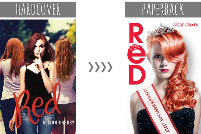
I’m seeing red because of these covers. (Get it?) I really not fond of either cover, but more so for the paperback cover. Just why?
Genuine question: are there people whose hair are naturally those shades of red?
In both covers, the red hair color looks really unnatural. It was probably done on purpose, considering what the book is about — a girl afraid that people will find out she’s not a natural redhead. Though, I really wish red color was more believable (especially the paperback one, yikes!). I think that’s one of the reasons why I cringe when I look at these covers. I wonder if the other characters in the book can tell that the main character’s hair color comes from a bottle because those red colors aren’t fooling anybody. (No siree.) Who thought the red color in the paperback cover was a good idea? It looks so weird. I really really reaaaallllyyyy don’t like it. (I don’t even know how to describe how much this light red color bothers me.)
I really like the font and the color for the title of the hardcover one. It seems to balance the picture nicely. All the red colors aren’t really distracting and they complement each other. Whereas, the font and color of the title for the paperback are a totally different story. What is that mess? Is it just me or does the color for the title in the paperback cover look a bit pink? The different reds don’t work well together. It’s chaotic and cringe-worthy. Also, where is the model’s right arm? I know she has her hand behind her back, but how she’s posing looks awkward. She looks really fake and like a doll that children play with. The paperback doesn’t work at all.
Which cover design do you prefer? Is there anything you would change in the covers?
(Note: I have yet to change the feature title because I’m still searching for the perfect name. :P.)


I don’t even know why they would want to change to the paperback, it looks absolutely horrible! The hair looks way too artificial and looks like it was coloured with Photoshop. I guess maybe they might have wanted to cater to a different audience since I heard the book was more MG than YA but still, it’s such a downgrade. Her skin looks too greyish too that it looks a little scary. Just nope at this entire redesign >:(
Considering that the plot of the book is a bit of a joke (based on the blurb, since I’ve never read it), should I be surprised that the new cover looks a bit like a joke, too? April Fools IS around the corner, after all… ;) But yeah, I do not like this new one. She looks more like a Barbie doll than anything else, and yup — the title of the new cover is definitely more pinkish than red. Nice job, Quercus!
Do you even need to ask?! The original cover is WAAAAAAAAYYYY better. It actually looked like a decent contemporary read, while this one is just no. *cringe*
I don’t like either one of them! The hardcover is a bit better, though, so I don’t know why they would switch to the paperback, which is just horrible!
Ick that paperback one!!! She looks undead. If they put a little blood dripping from her mouth it could totally be the cover for a vampire prom book!
I really dislike both of those covers. Then again, I really dislike basically all covers that have people’s faces staring at me. I prefer more abstract, artsy covers, than ones that look like model headshots or stock images lol.
Plus, I totally agree about the hair colour here (in BOTH copies). Why can’t hair just be red? Why does it have to be these abnormal, ‘unique’ shades? To show the MC’s individuality or something? It’s like when I read in a book that the character had hair that was a light copper with streaks of auburn or something. I’m just like, ‘dude. She’s ginger. Just say that.’
I’m not crazy about either cover, really, but I much prefer the hardcover over the paperback. First of all, you’re right–the paperback’s model’s hair looks pinkish to me. Also, it does make the book look like a joke, like some cheesy teenage Disney show or something (not that there’s anything wrong with Disney). As a YA reader, the paperback just looks like something I’d be “too old” to read and enjoy. And also (this is just a pet peeve of mine), there’s too much white on the paperback cover! That much white makes me go ughhh.
I’m not really bothered by the hair colour. What I am bothered by is the boring over simplicity and stark white of the paperback. At least the hardcover looks like it has more personality and it’s just more interesting overall. But I think the paperback is not interesting at all, largely due to the plain white background that makes it look like a stock image.
The paperback is just a complete sign of a lack of skills in design and graphics. It’s just horribly distasteful. It’s something I might see on Wattpad, but not a published book. The background, the font, the hair, and the model just look horribly unprofessional.
The other one, though not the best, at least has a better design and something to do with the synopsis. That hair may be fake red, but at least it doesn’t look like fake hair.
As someone who’s unfortunately read this book, I think the cover does a perfect job at representing the story: it’s awful. If I had to choose between the two covers, I’d definitely pick the original. That paperback cover looks like the work of someone’s mediocre photoshop skills. I honestly don’t know how that was even approved.
I’m not very fond of either but the hardcover would definitely get my vote in the battle. The paperback just looks so bleh and her hair color is more pink than red… Also I feel like the positioning of the title and the author’s name is so weird and the text on the ribbon really confuses the whole cover. At least the hardcover has the font going on for it!
One word: Yikes :/ The model’s skin in the paperback is so unnatural looking. I’m not a huge fan of the font placement nor the typography in the paperback either.
I’m not really feeling either cover but if I had to choose one, I would go with the Hardcover one. It’s better than the paperback at least, lol.
My hair is pretty close to one of the girls turned around on the first cover, but I agree that the 2nd cover looks really unnatural
http://aflurryofponderings.blogspot.com/2014/03/road-to-somewhere-blog-tour.html
Hi there!
I have to agree with you, that shade is just awful… It actually reminds me of anime hair. While I’m not exactly a redhead, my hair straddles the line between red and blond, and I’ve never seen hair naturally that shade.
(just found your blog, and I love it!)
As a redhead, I would laugh in their face if they tried to tell me they were natural with THAT colour! How is this a full-length book? It’d be like two paragraphs long.
The paperback cover takes the Awful crown, though. At least the hardback has some personality.
I really don’t like either of these covers, to be honest. But if I had to pick I’d pick the hardback. Because of everything you said you didn’t like about the paperback. Fake red hair, weird pose, clashy and messy. It’s just a hot mess of a cover, really.
But then the hardback cover …. the main model’s hair isn’t even really red. It’s like mahogany or maroon or something. And I don’t like her shirt or the pose she’s pulling.
Final judgement: NOT A FAN OF EITHER, CEELEM.