
Inspired by What She Reads, Pure Imagination Blog, and Stacked.
I admit I’m a book cover snob. Who isn’t though?
Book covers are the first thing that attracts readers to a book. A good cover can draw someone is, just as a bad cover can easily draw someone away. It can essentially make or break a book. Holy, Mother Cover! is where I showcase the book covers that stand out (or make me cringe), and discuss cover changes.
(A big special thanks to Georgie at What She Reads for bestowing me this fabulous name and to Charlotte at Gypsy Reviews for creating the beautiful feature banner you see before you.)
COVER CHANGE: This Song Will Save Your Life by Leila Sales
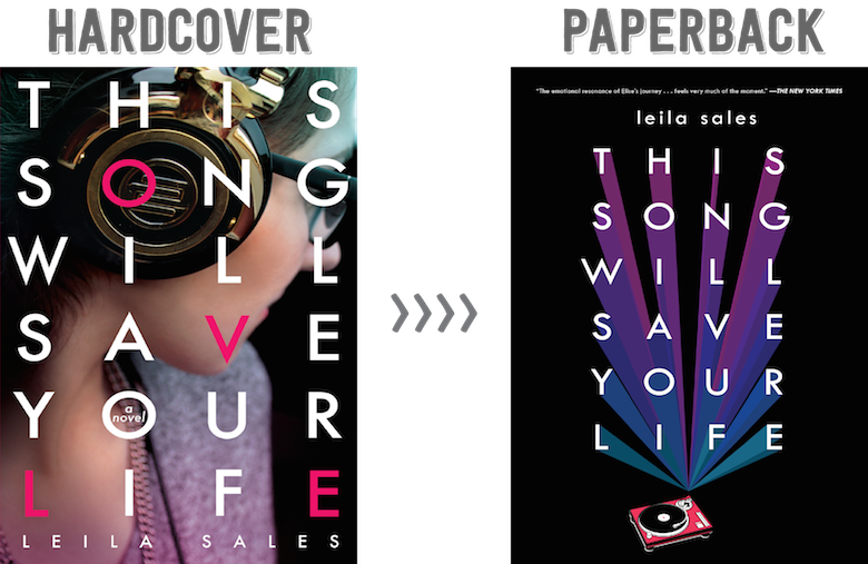
I love the way the letters of the title are spaced out. It uses the entire cover, and that works extremely well. I love how “a novel” is tucked inside the ‘O’. The colors and the background picture of the model doesn’t distract me. And you know what’s the best part? “LOVE” is spelled out in pink! I never paid close attention to why the letters were in a different color, so seeing that thrills me. (Thank you, Charlotte, for alerting me.)
Though, it bothers me that the cover doesn’t feature a turntable. It’s an extremely huge part of the story. I didn’t understand, at first, that the headphones were there to emphasize music. When I did, I thought it was weird that it wasn’t as clear.
Would I buy this book based on the cover? YES. I own a copy, so.[/column] [column size=”1/2″]What do I think about the cover design? It’s a decent design?
It’s simple and focus on what’s important. It’s telling you that music is what save the main character’s life. I love the colors and how it complements each other. And that turntable! I’m so happy to see it here. The hardcover was missing this important image.
But it’s not my favorite cover of This Song Will Save Your Life. I don’t like the black background. It’s good that it makes the colors, the title, and the turntable the focal point, but for some odd reason, it gives me a headache because it makes the cover look a bit dated. Also, I don’t like how the colors are angled. I just wished it was more three-dimensional.
Would I buy this book based on the cover? Nope. Not for me.[/column][/row]

NOPE NOPE NOPE NOPE to the cover over there with the hella bad black
I mean, I love the original one. The font. The LOVE. And I don’t really mind that there’s no turntable because those earphones are hella rad. I mean, they look a little vintage. And they’re gold. Just imagine wearing those with a pair of big shades and it will be awesome.
And then there’s the new cover which is all ewww. What they did with the font was cool but it’s so underwhelming. Ugh. It looks so bland which is absolutely not what the story is at all.
For some reason the paperback appeals to me more although I can totally see why you like the hardcover more. I think it is because I am sick of seeing real people on the covers of my books and like the cool font thing on the paperback. I don’t know. lol
I actually really like both of these! I wouldn’t call either of them gorgeous covers, but I think they’re good. For some reason I have a really sentimental attachment to the hardback cover, though–maybe just because I have a sentimental attachment to the book? And the book was so personal for me that once I loved having a real person on the cover, and the coloring. Also, I hate the font for the author’s name on the paperback. They. . . kinda gave up there, and it always annoys me when the author’s name isn’t capitalized properly(I don’t know why publishers ever do this, honestly. The author name would look so much better with the proper capitalization). So I definitely have a preference for the hardback. . . but I do like both.
I agree with you, the first cover looks better. I haven’t read this yet, so I can’t say much about it fitting the content. But the second cover just looks a bit too empty.
I never realized the coloured letters spelled love, how clever! It isn’t the best cover I’ve ever seen, but I like it more then the second one.
Hmm I like both covers but I think I’ll choose the first cover as well because I like how the letters L-O-V-E are highlighted. I also like how there is a girl on the cover with her headphones on. The cover says a lot about the plot compared to the other edition.
I like both! I just read this with the hardcover, and find it endearing. But, the little turntable is cute.
Maybe I’m in the minority but I really like the new cover! Something about the font and the way the words pop is really eye catching to me!
There are a lot of things I like about the paperback cover, like how the font treatment is pretty much identical to the hardcover besides the 3D lines; the gradient of colour and how it all pops against the stark black. I like that it’s brighter and more saturated than the hardcover which, despite being a good cover, I think is a bit too dull. The huuuuge bugbear I have with the paperback cover, though, is the turntable. I hate that it’s off-centre! That and the alignment of ‘leila sales’ (which might be centred, I’m not sure; if it is, the turntable makes it seem off-centre to the other side) really shifts the cover out of balance for me, and it’s quite uncomfortable to look at. :(
I have a feeling I would appreciate the paperback a lot more if the letters didn’t have the shadow effect; I find it kind of distracting. I do like the hard cover version, but it doesn’t make me go “WOW”. Though, I too just noticed the pink letters spell out “love”, and that is pretty neat :)
I am not a HUGE fan of this book, but the reason I wanted to read it was the cover! The paperback cover doesn’t do anything for me. I’m not usually a fan of “real” people on my covers, but I thought it was really well done. It was certainly eye-grabbing.
At least this isn’t a series? One of my pet peeves is the cover switch after the first book. At least a lot of them are finally going back and rereleasing so the covers match, but still. *shakes fist*