
Inspired by What She Reads, Pure Imagination Blog, and Stacked.I admit I’m a book cover snob. Who isn’t though?
Book covers are the first thing that attracts readers to a book. A good cover can draw someone is, just as a bad cover can easily draw someone away. It can essentially make or break a book. Holy, Mother Cover! is where I showcase the book covers that stand out (or make me cringe) and discuss cover changes.
(A big special thanks to Georgie at What She Reads for bestowing me this fabulous name and to Charlotte at Gypsy Reviews for creating the beautiful feature banner you see before you.)
I’ve missed doing these theme posts. I’m not quite sure why I haven’t been doing it (maybe a bit of laziness and being overwhelmed by work and stuff), but here I am with this post! Taking that long break may have been a great thing because now, I’m pumped to collect the covers and talk about its beauty.
I was looking through covers for Summer books and noticed that a lot of them have that lens flare effect to them. I was absolutely mesmerized by them, and thought why not showcase that?
THEME: Lens Flare
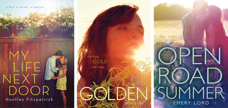
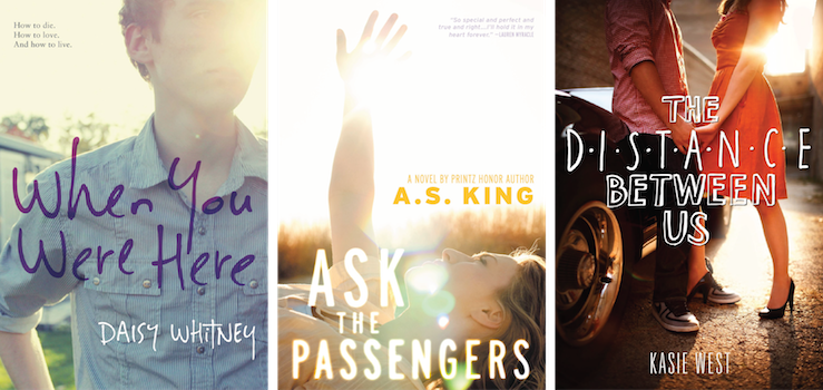

My favorite lens flare is the one on When You Were Here (and yes I love the format of this post). I also love that book so much so I might be a bit biased. Ask the Passengers is really pretty too. I really like the lens flare trend, but I also don’t like seeing it on a bunch of books all at once because that makes it feel so overdone, if that makes sense?
I personally love lens flares (some of my friends hate them!), and all of these covers make me happy just by looking at them :D I’ve heard of all of them except for When You Were Here – that one looks REALLY good. Not to mention the typography; loooooveee that!
I’m going to say my favorite is the Distance Between Us but I just noticed that When You Were Here and I haven’t ever hear of that one before so now I have to go look that up. :)
I’ve never thought about lens flare before, but now that I look at them all together I really like them :) Golden and My Life Next Door are my favs!
Ohmygod NO where is her other leg WHY DOES SHE ONLY HAVE ONE LEG
I LIKED THAT COVER AND NOW I WILL JUST BE IRRITATED BY HER LACK OF A LEG
I do like covers with lens flares though, they are uber pretty in my humble opinion.
My favourite of all WAS The Distance Between Us but we all now how I feel about that one now. After that, I’d probably say Open Road Summer. Like you, the colours are growing on me and I just really like that cover in general.
You should totally do more theme posts because this one is fab. <3
I think the lens flare works really well with Golden because of the book title and just how the cover looks. My favorite one though is Ask the Passengers because I like how the girl is reaching towards the sun.
Woah, what the hell is up with her leg?? That’s so weird. I don’t think it’s possible to stand like that haha. Maybe it was a photoshopping mistake?
I love lens flare covers…my favorite of these is probably Golden. I haven’t read the book, but I’ve always loved that cover!
I can’t get over how ugly the glow of the font in Open Road Summer is. That one small detail, and I’m repulsed not only by the cover but I’m also having no intention to read it. Despite how tempting all the good reviews are.
And lens flares are so pretty. They can make a simple photograph so much more different. My favorite is My life Next Door, though. I love the one for Golden, but it’s mostly because of the flowers; for MLND I love the summer feel of it.