[note note_color=”#31338d” text_color=”#ffffff”]Brimming with humor and one-of-a-kind characters, this end-of-the world novel will grab hold of Andrew Smith and Rainbow Rowell fans.
An asteroid is hurtling toward Earth. A big, bad one. Yuri, a physicist prodigy from Russia, has been called to NASA as they calculate a plan to avoid disaster. He knows how to stop the asteroid: his research in antimatter will probably win him a Nobel prize–if there’s ever another Nobel prize awarded. But Yuri’s 17, and having a hard time making older, stodgy physicists listen to him. Then he meets Dovie, who lives like a normal teenager, oblivious to the impending doom. Being with her, on the adventures she plans when he’s not at NASA, Yuri catches a glimpse of what it means to save the world and save a life worth living.
Prepare to laugh, cry, cringe, and have your mind burst open with questions of the universe.
Goodreads · Amazon · Barnes & Noble · The Book Depository · IndieBound· Indigo · Library[/note]
I am absolutely honored to be part of the Learning to Swear in America blog tour!
Today, I have the great pleasure of having the book designer of this wonderful book on my blog. Meet Betts Greene!
| Q&A WITH BOOK DESIGNER, BETTS GREENE |
|---|
- What is your general process like when you’re first mocking up a cover?
Betts: My process relies heavily on the design brief I get from the Editor & Art Director at the start of a new project. The brief outlines the goals of the cover, lists the competition, includes a summary of the book, and talks about the intended audience. After reading the brief I research competitive covers by: going to bookstores to see what design styles are popular right now; browsing Goodreads “best covers” lists to see what designs readers are excited about; and looking at the covers of similar books readers have bought on Amazon. This research gives me an idea of how to design a cover that will both fit in with the competition and stand out from it. I then brainstorm 4-5 different ideas to mock up.
- Do you read the book you’re designing the cover for?
Betts: Definitely! Especially for a book that feels like it needs an iconic or conceptual cover. You need to be really familiar with the story to find the exact right symbols to communicate the book’s content to readers.
- When you started mocking up the design of Learning to Swear in America, what elements of the novel did you want the cover to highlight?
Bettes: I went back and forth between focusing on the driving tension of an impending asteroid impact and the utterly charming relationship between the main characters, Yuri and Dovie. In the end, the funny title and the wry, funny tone of the writing leant themselves more strongly to the impending asteroid hit (though I did mock-up a couple options that hinted at the romantic side of the book).
- Why did you go with a minimalist design as opposed to something with lots of illustrations or photo work?
Bettes: One reason is because minimal designs are trending in YA right now—especially in realistic fiction—and although Learning to Swear can be classified as Science Fiction, it reads very realistic and current. The other reason is because it fits the content so well—Yuri’s direct and witty voice, the world of calculations and charts that he inhabits, and to bring to mind a tongue-in-cheek instruction manual to help a foreigner “get” another culture. It can also be easier to make a cover feel gender neutral with a minimal design. This book is great for male and female readers, so that was important.
- How many drafts did you have to make until you decided on this final cover?
Bettes: I think I initially submitted four or five very different rough ideas. Out of those, the Art Director (Donna Mark) gave me feedback on hers and the Editor’s two favorite directions. From there, the feedback narrowed down to one direction. I made a couple more changes to it (one change was to censor it a bit more :) Ultimately, it took about 4-5 rounds to get to a final cover.
- How much and what kind of input do you get from the art, marketing, and editorial department for this cover? (If there are any, that is.)
Bettes: The amount of feedback varies a lot from project to project. Most of the feedback on this one was how to push the envelope with swearing and edginess without going too far.
- If you had to pick, which book cover design is your absolute favorite?
Bettes: The answer to that question changes constantly! There are so many fantastic covers and designers out there. I will say that I’m loving the resurgence of illustration on YA covers. There have been some really interesting and edgy styles showing up lately. I hope the trend continues.
| BLOG TOUR STOP |
|---|
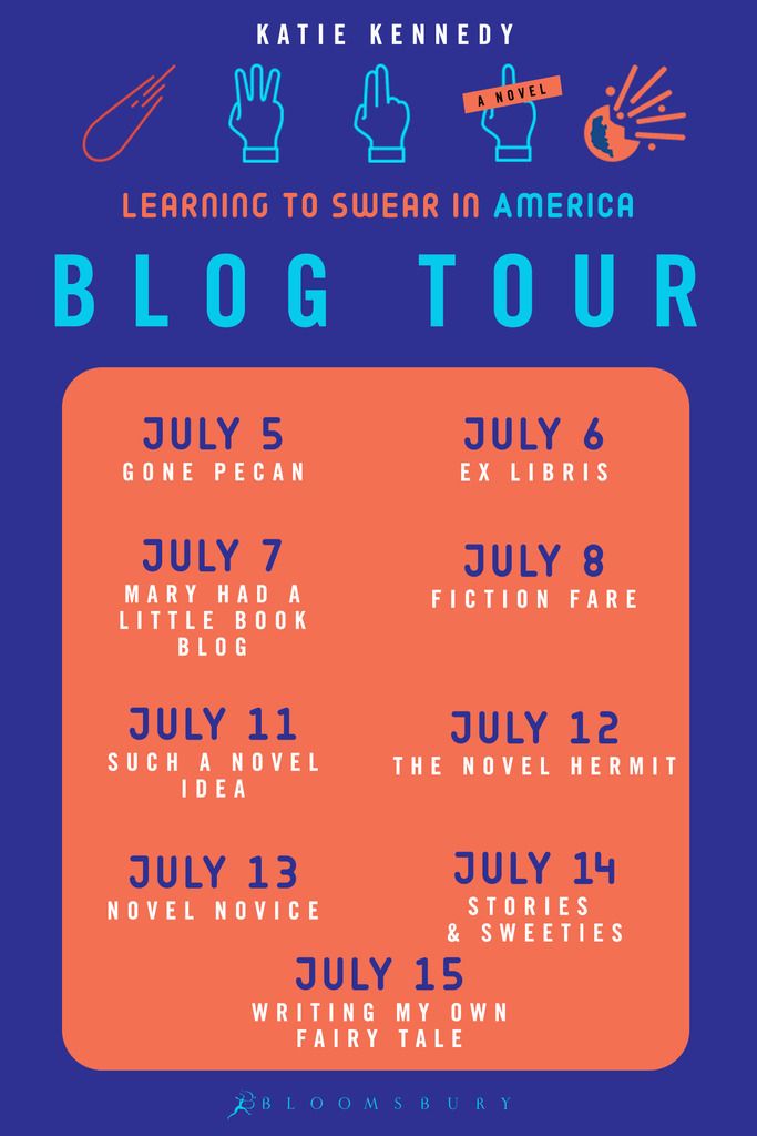 Check out the other blog stops:
- July 5 – Gone Pecan
- July 6 – Ex Libris
- July 7 – Mary Had A Little Book Blog
- July 8 – Fiction Fare
- July 11 – Such A Novel Idea
- July 12 – The Novel Hermit (that’s here!)
- July 13 – Novel Novice
- July 14 – Stories & Sweeties
- July 15 – Writing My Own Fairy Tale
| GIVEAWAY |
|---|
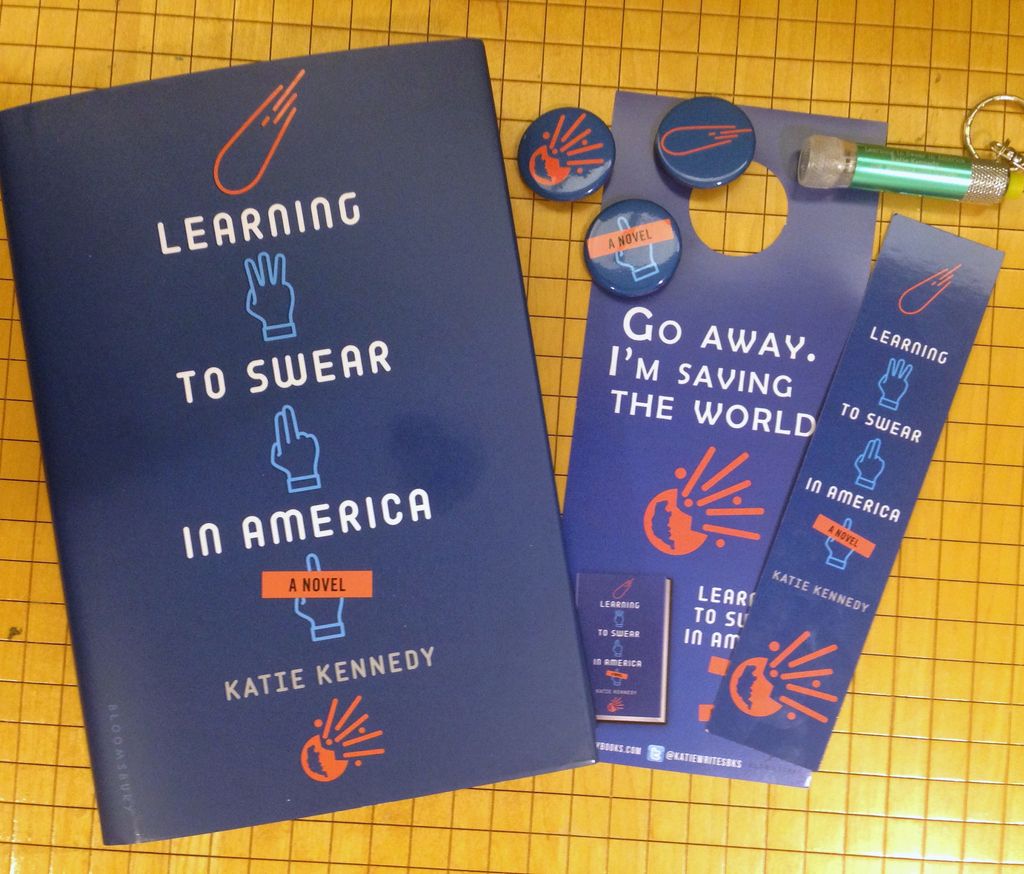
The lovely folks at Bloomsbury and Katie Kennedy are giving away a copy of Learning to Swear in America + swag!

Although this isn’t the usual book I read, it sounds really interesting and I’d love to pick it up soon. It was really cool to read bout the cover artist’s process, and I’m really glad he went with the minimalist look. It turned out great!